-
 Web Develope
 -
 Graphic Design
 -
 Drawing & Drawing Digital
 -
 Web Design
What my design skill included
I have a spirit of learning and always allow myself to absorb new things.
I make a point of learning every day, so I endeavor to improve myself ♥
-
 Photoshop
 -
 Illustrator
 -
 Indesign
 -
 After Effect
 -
 Dimension
 -
 Figma
Figma -
 Procreate
-
 Html
Html -
 Css & Scss
 -
 Javascript & Jquery
 -
 Bootstrap
 -
 Tailwind
 -
 Git
Git -
 Responsive


Once Upon A Time
Manipulation | 2023 | Behance
Once Upon A Time
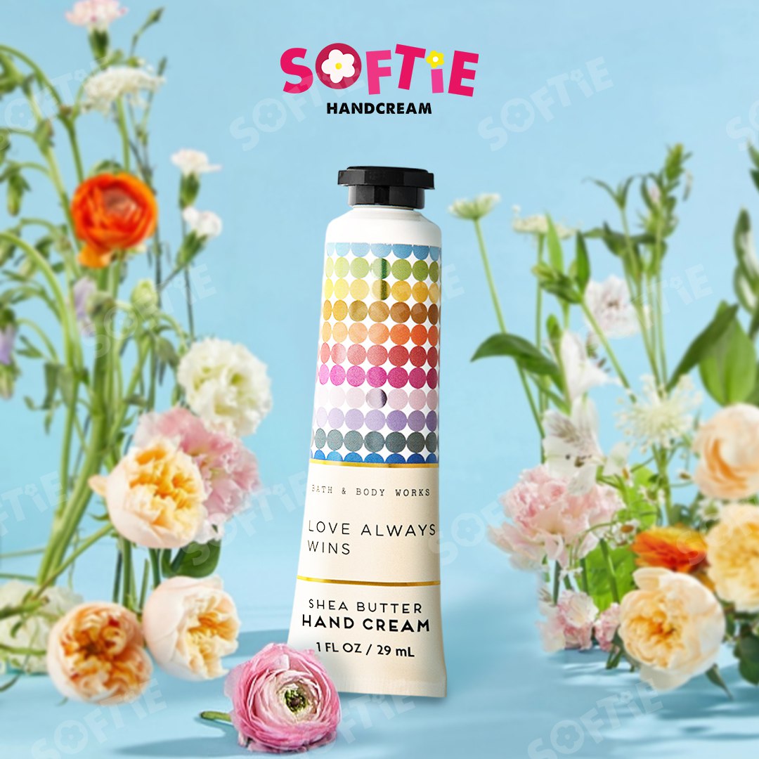
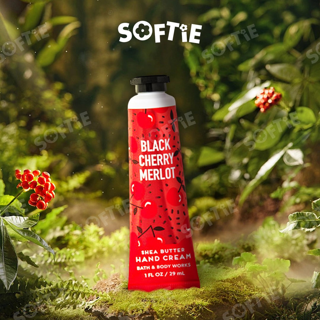
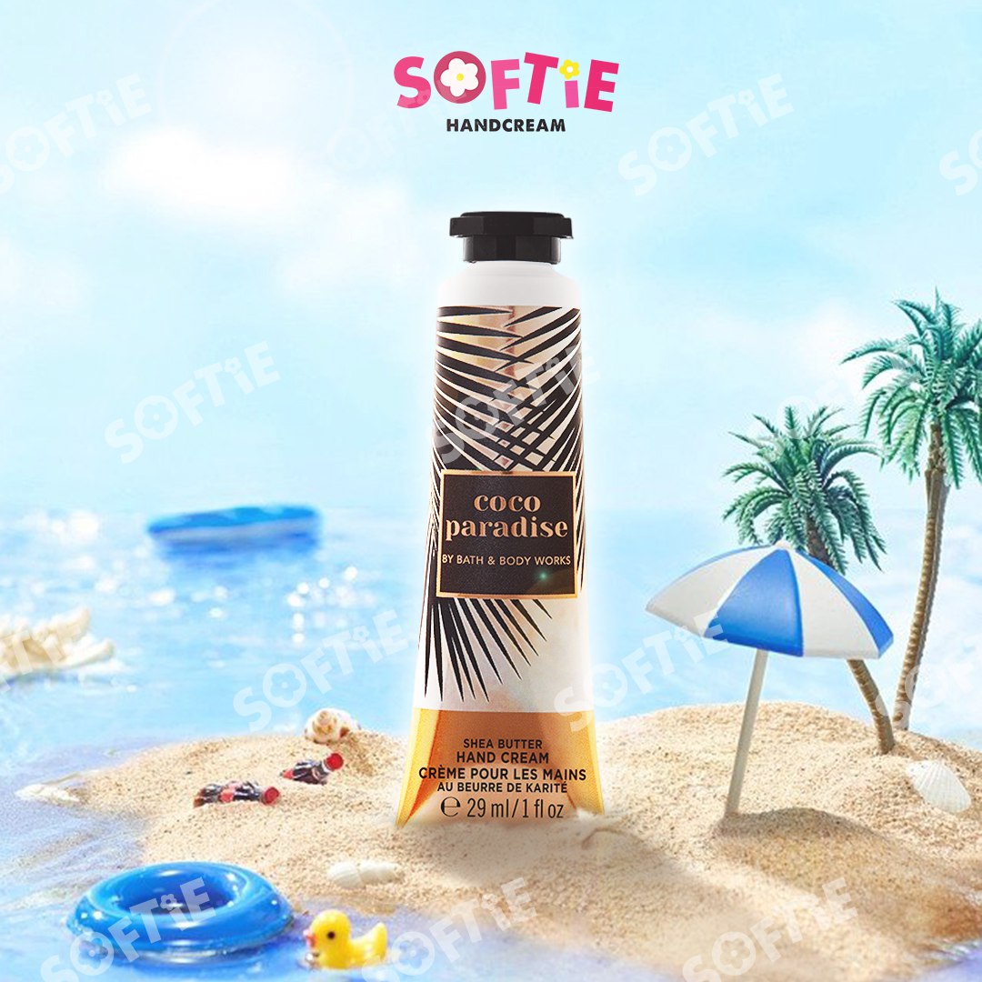
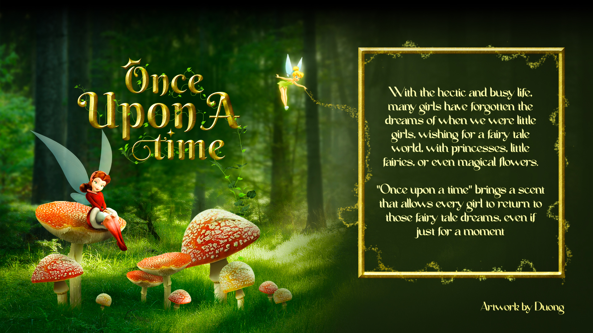
A unique project by a beauty shop brings the enchanting world of fairy tales to life through a collection of cosmetics designed for women. The aim is to evoke the nostalgia of childhood, turning daily self-care and beauty routines into an experience filled with magic and wonder. Each product serves as a gateway to a storybook adventure, where pampering oneself becomes a fairytale journey. The cosmetics are sourced from BBW, a renowned American brand celebrated for its high-quality products, and reimagined in a fresh, imaginative way. Drawing inspiration from the beloved character Tinker Bell and her fellow fairies, the brand creates a blend of timeless fantasy and modern elegance. This magical approach allows customers to embrace both beauty and imagination, offering an escape into a whimsical realm while enhancing their everyday lives.
YEAR: 2023

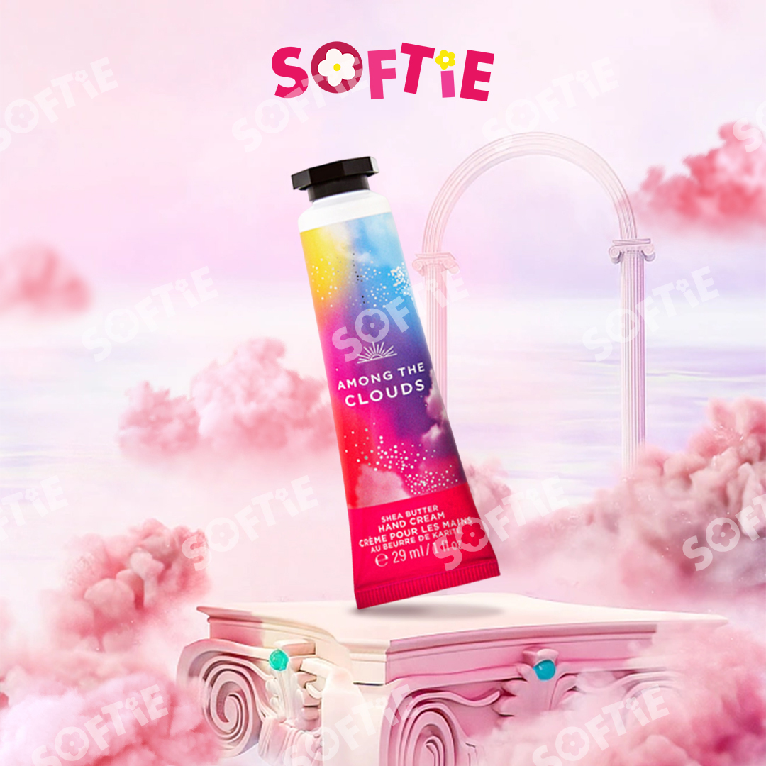
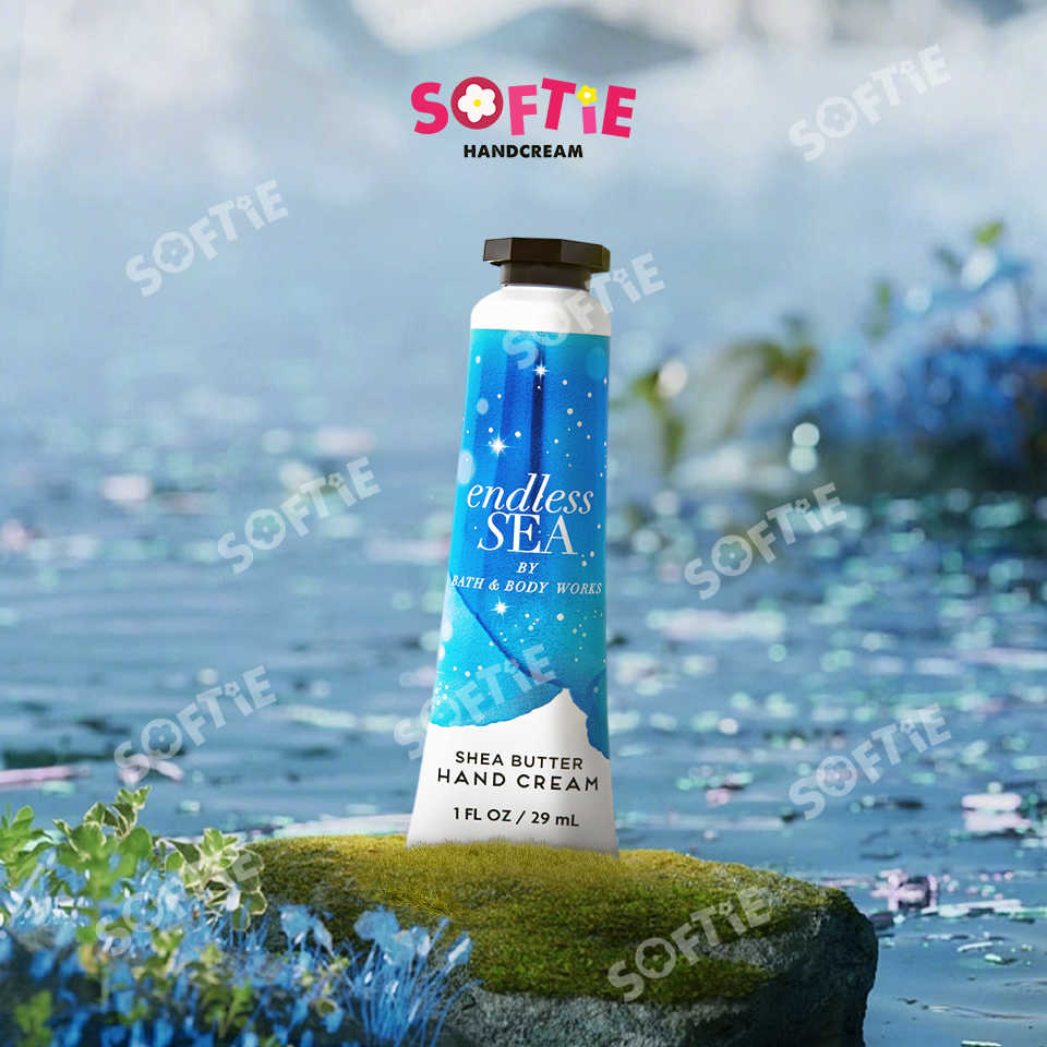
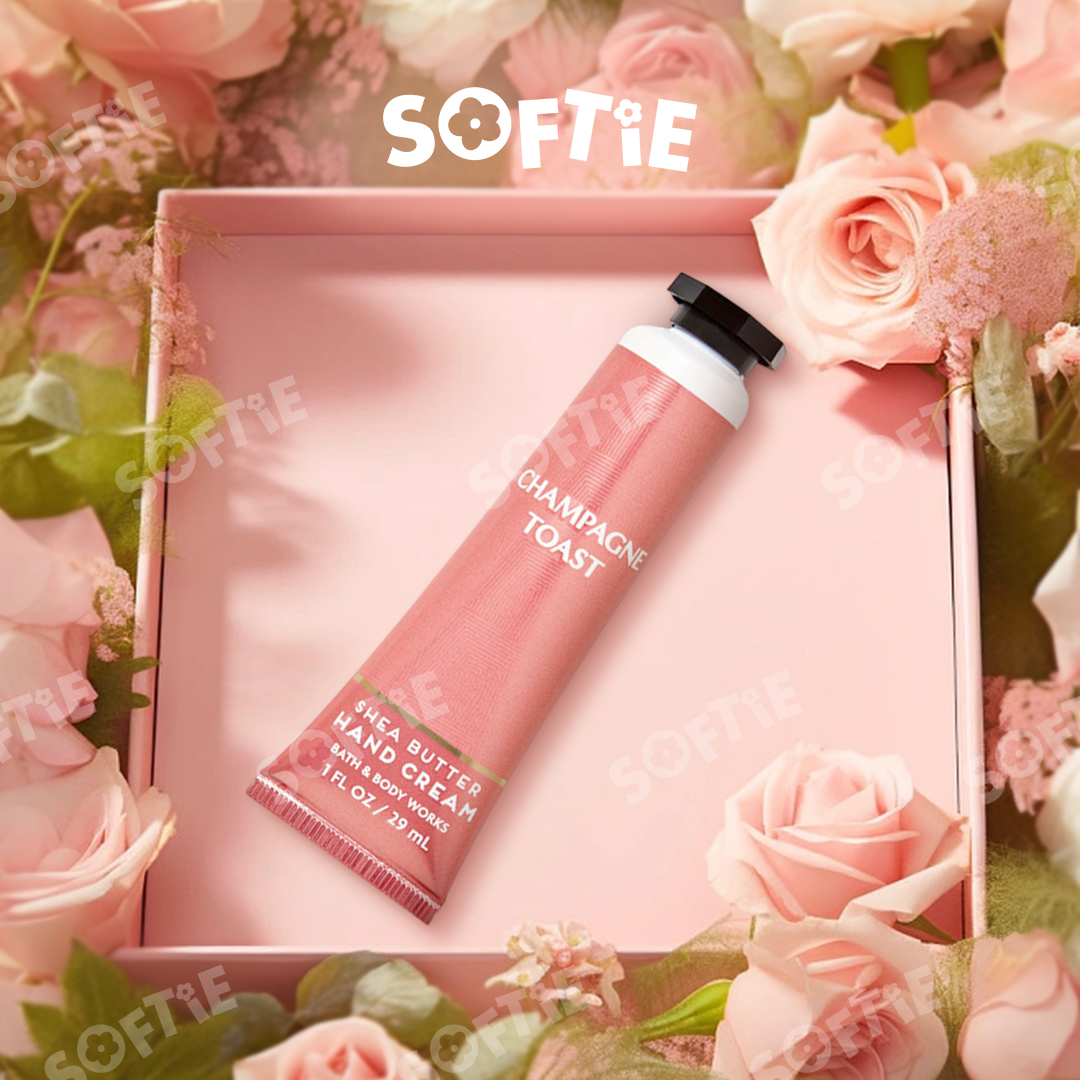
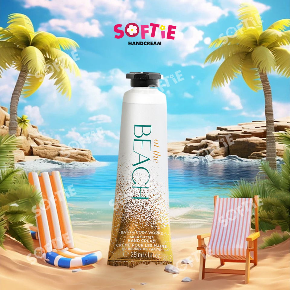
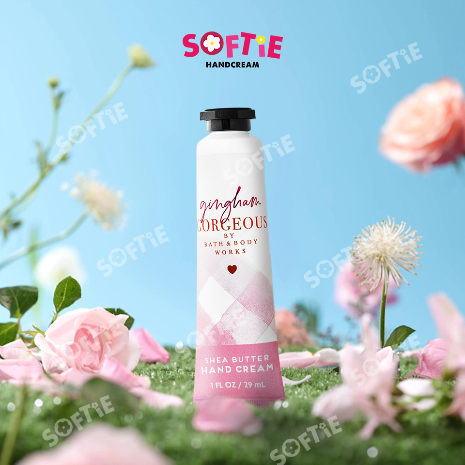
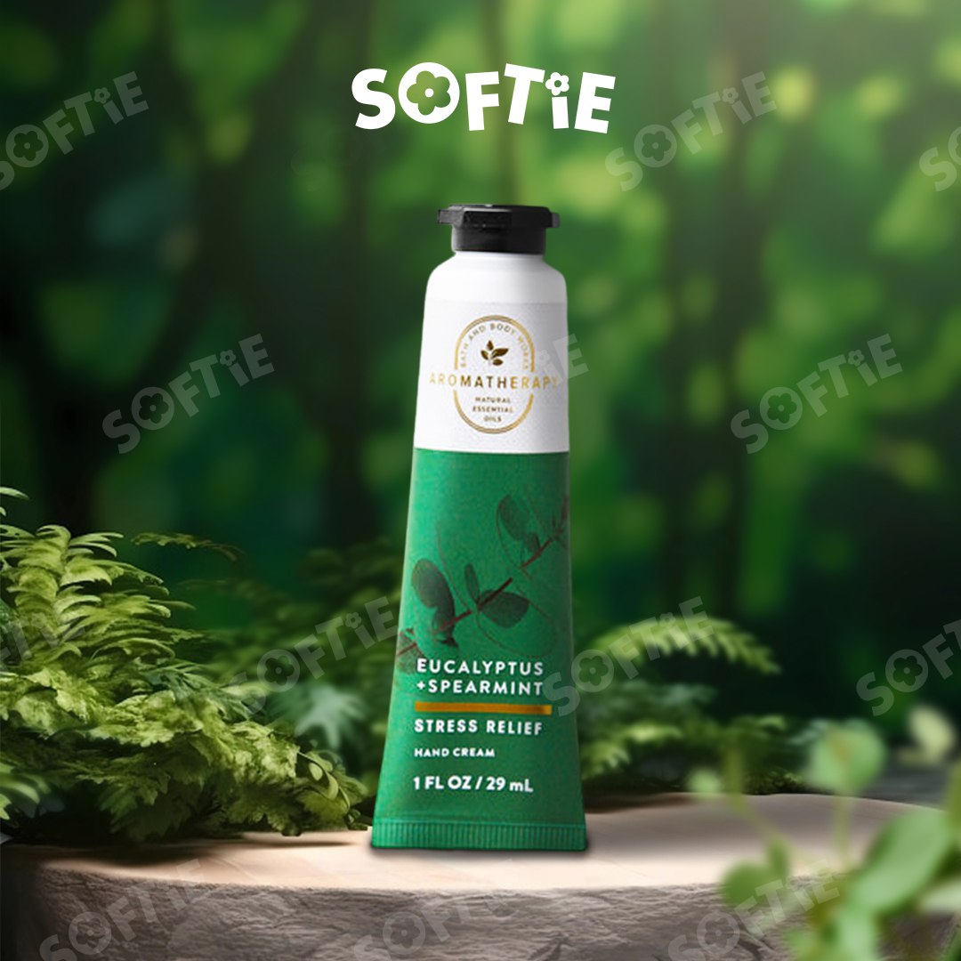
Softies Handcream
Manipulation | 2022 | Behance
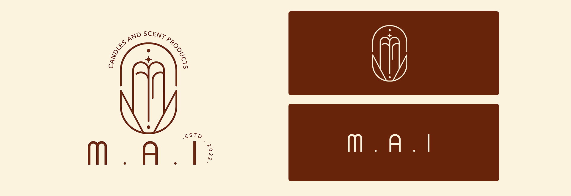
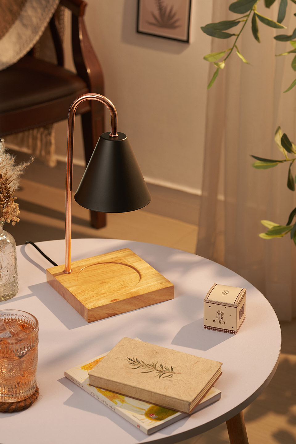
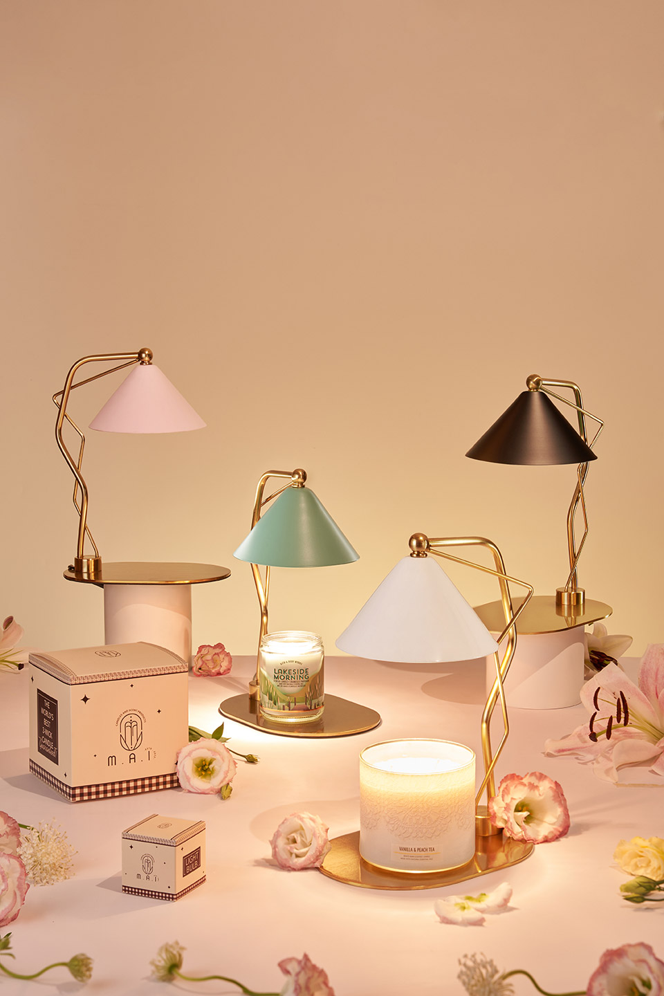
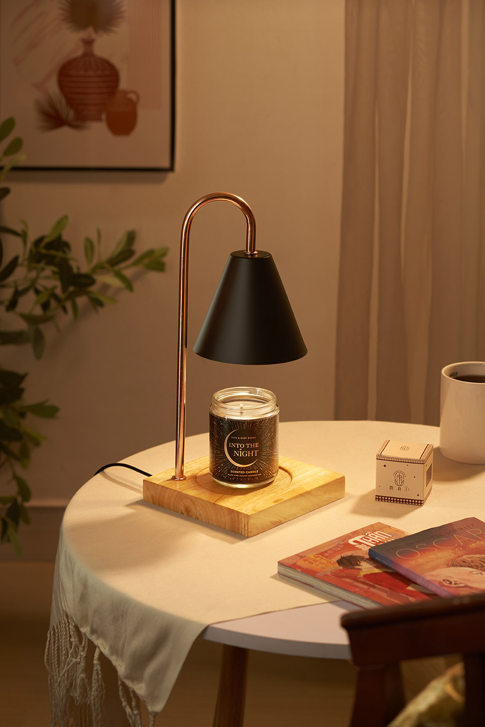
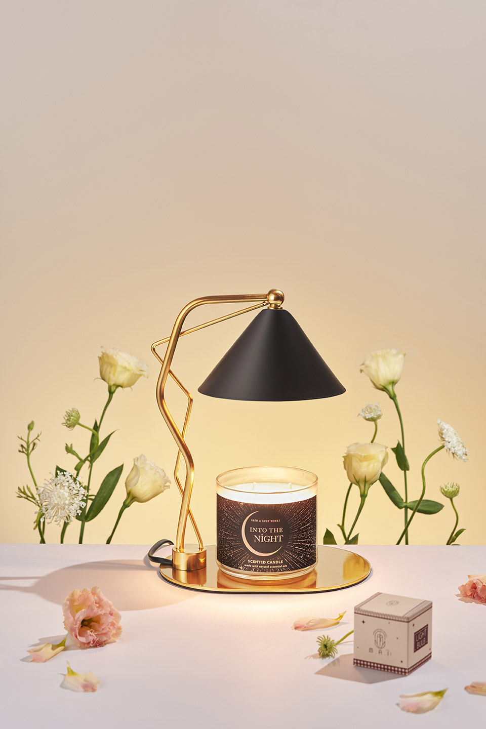
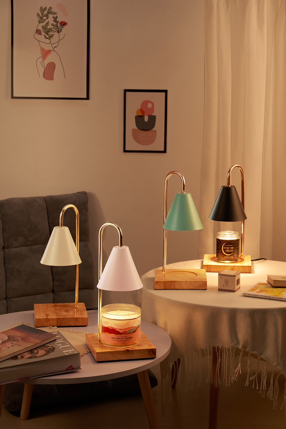
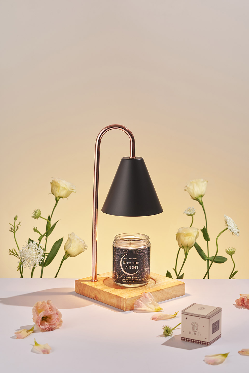
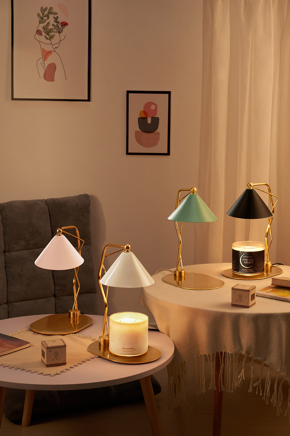
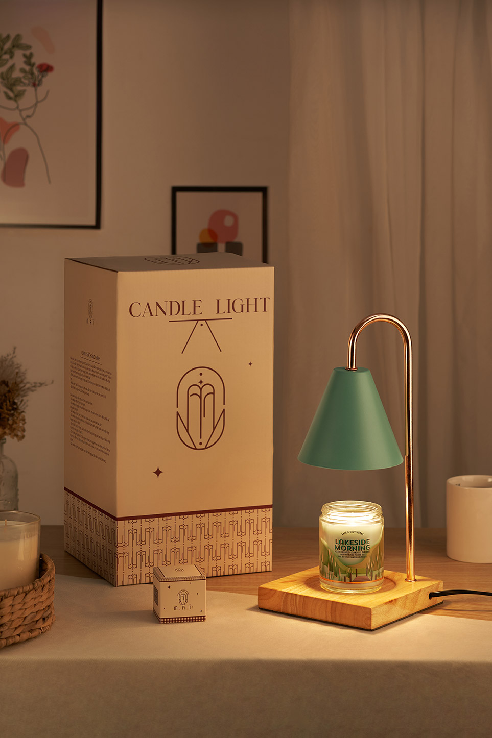
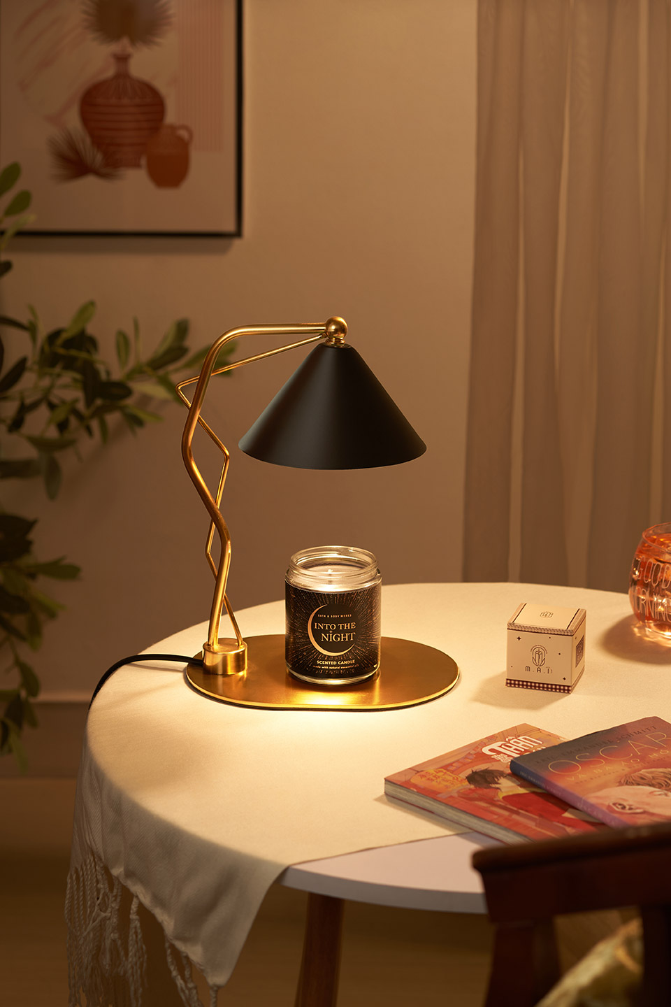
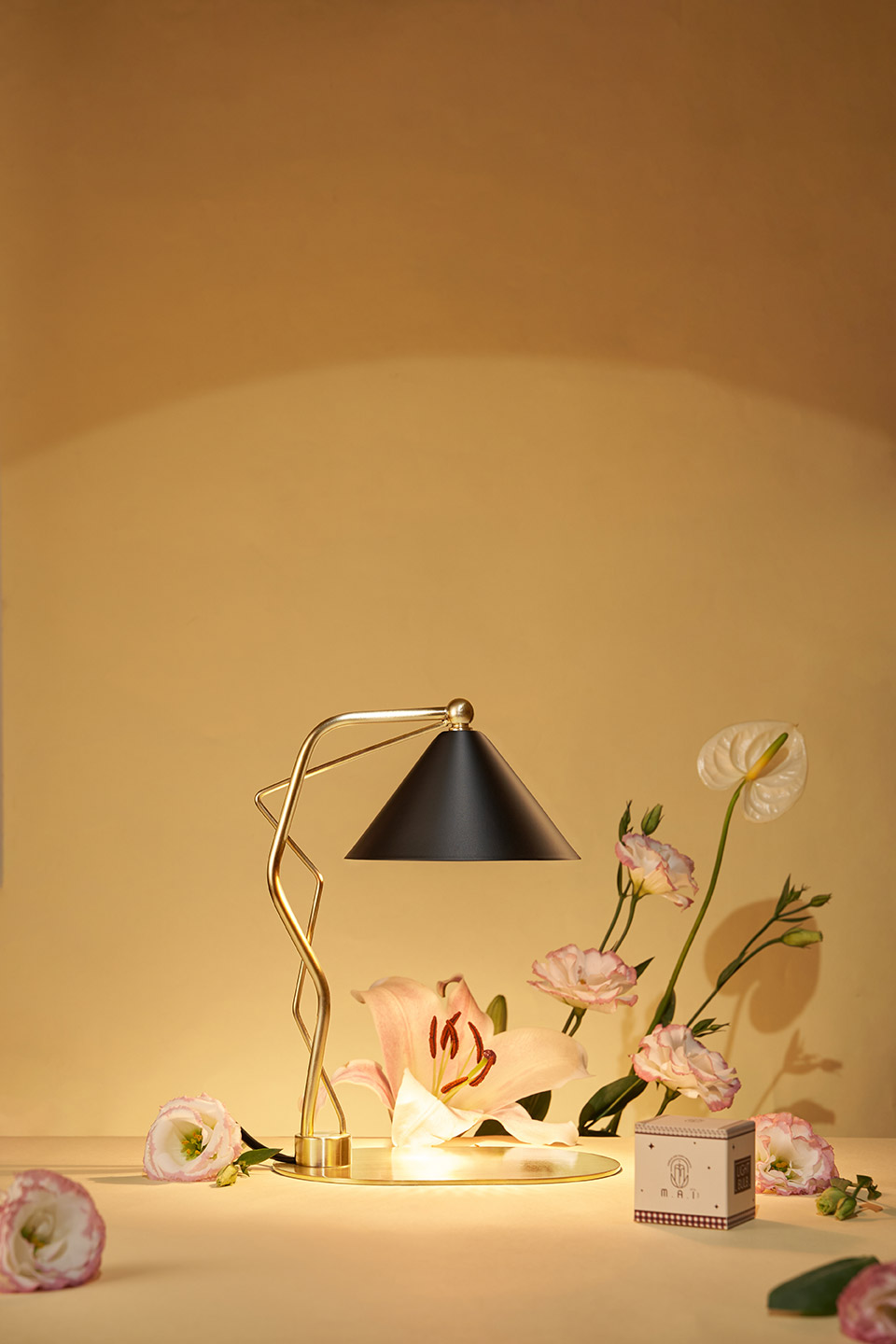
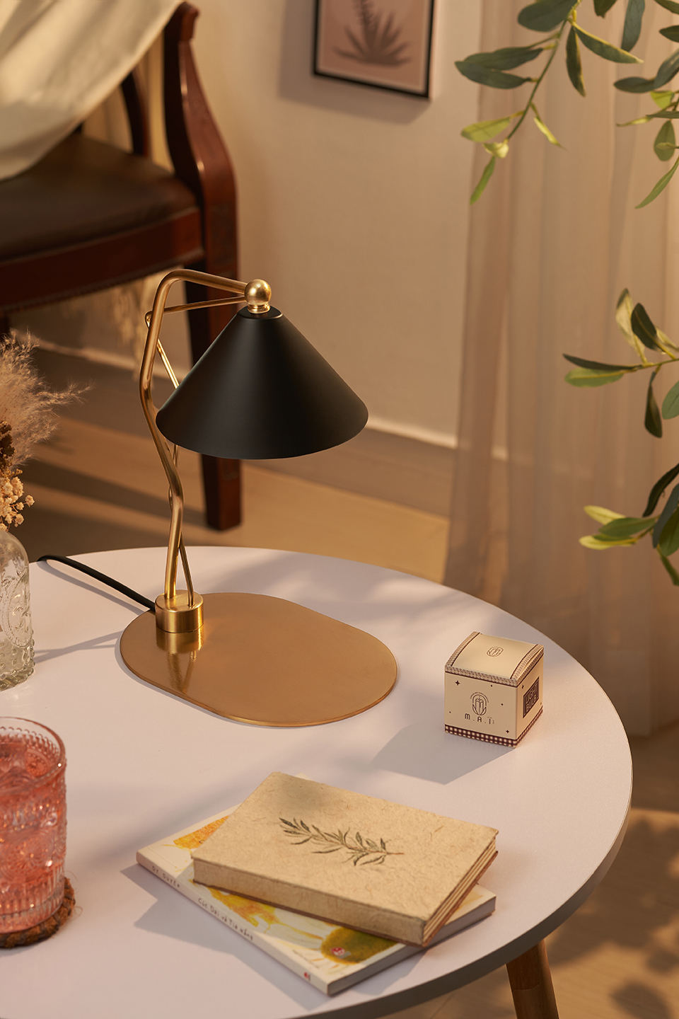
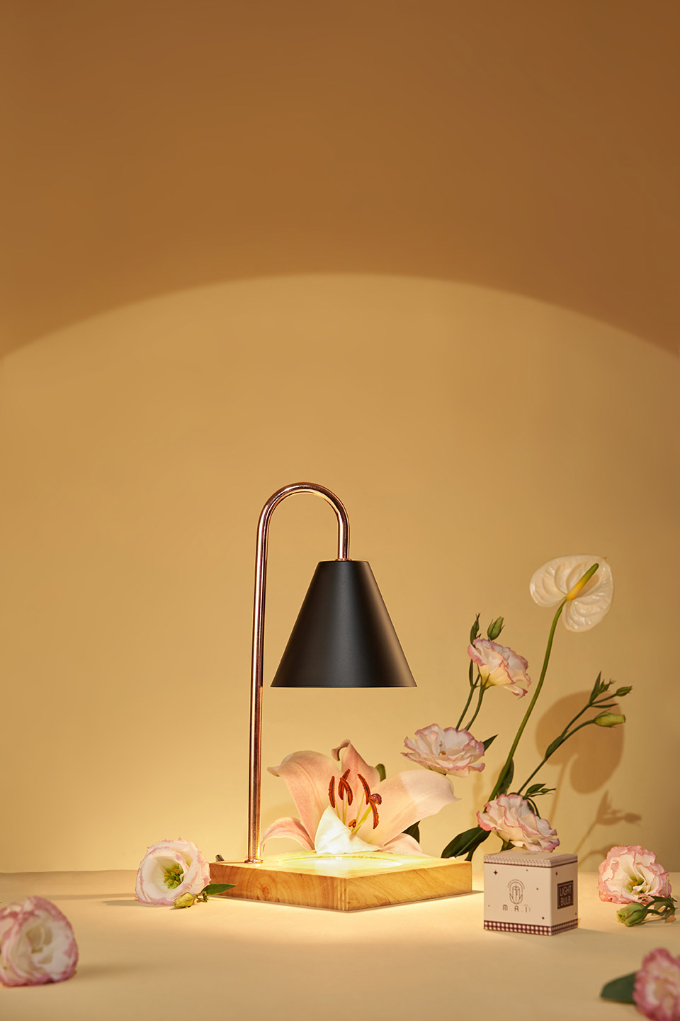
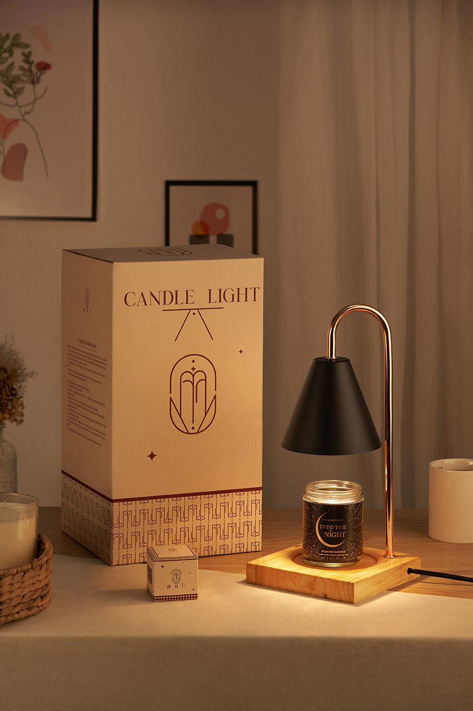
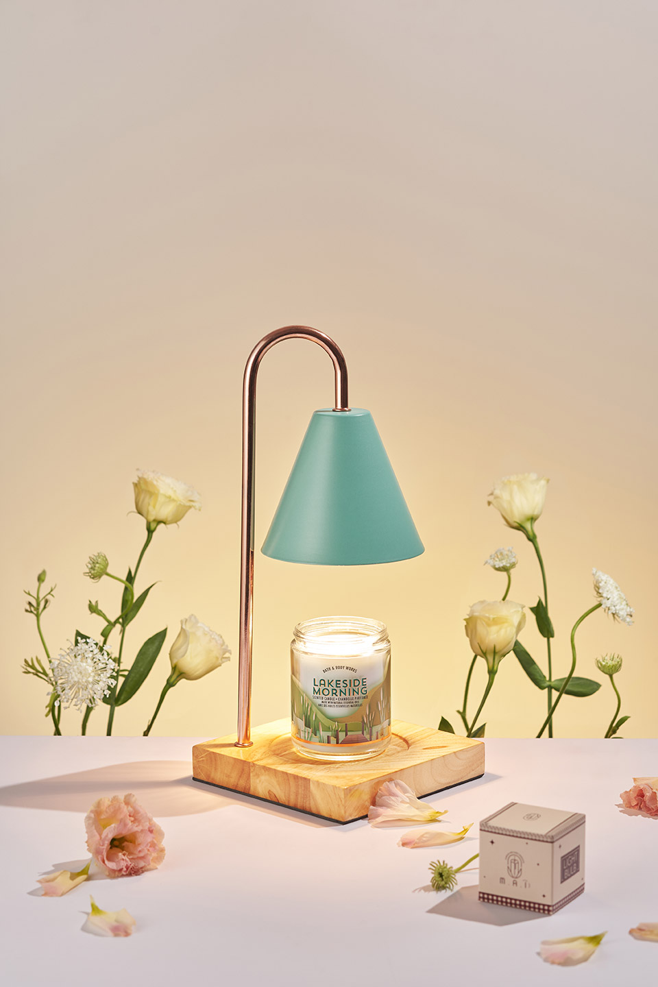
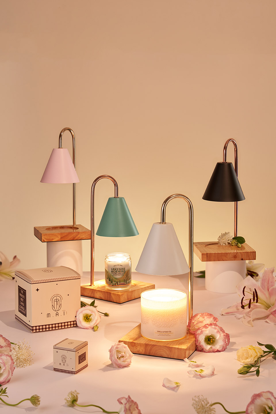
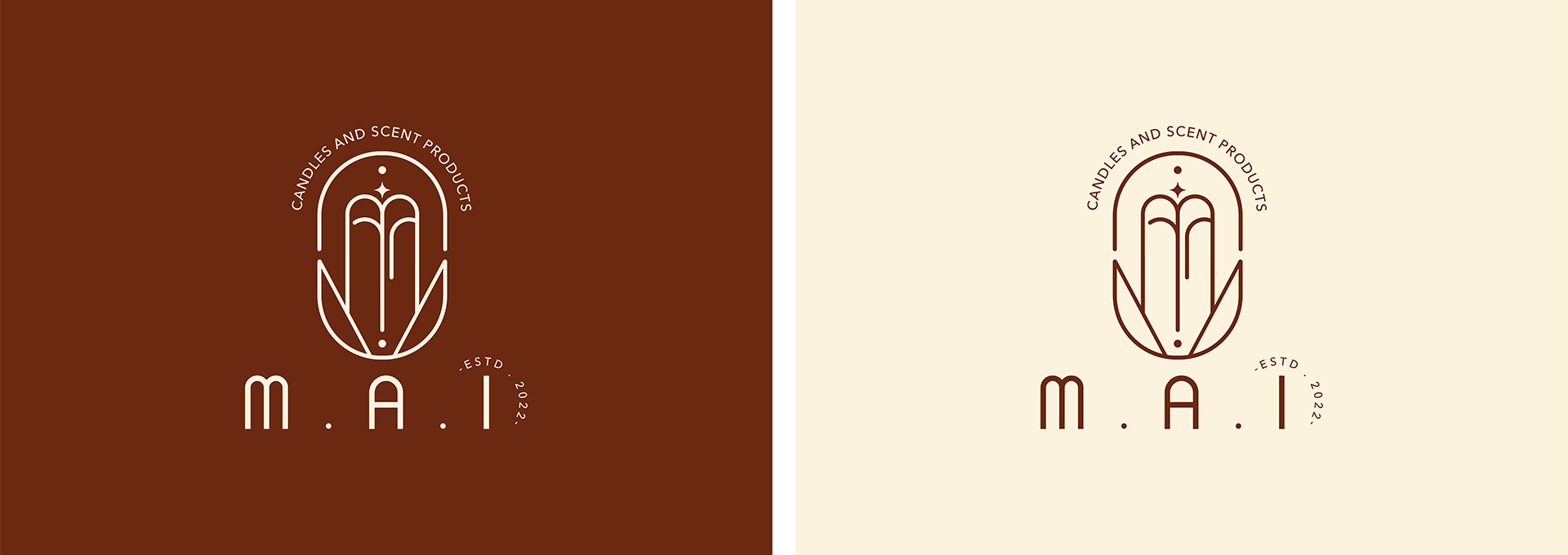
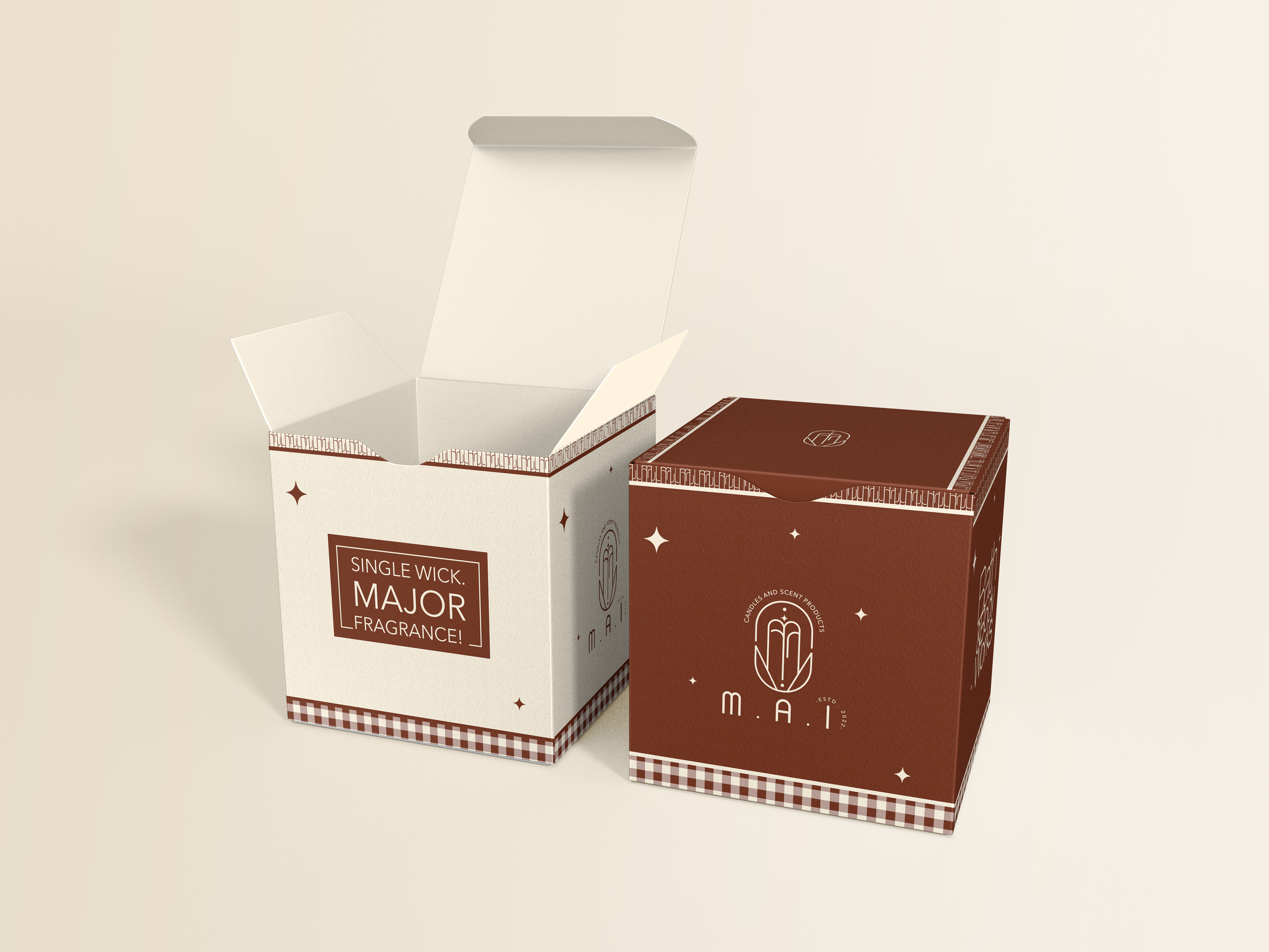
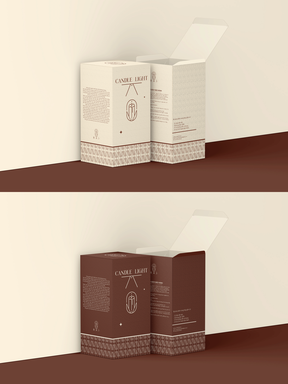
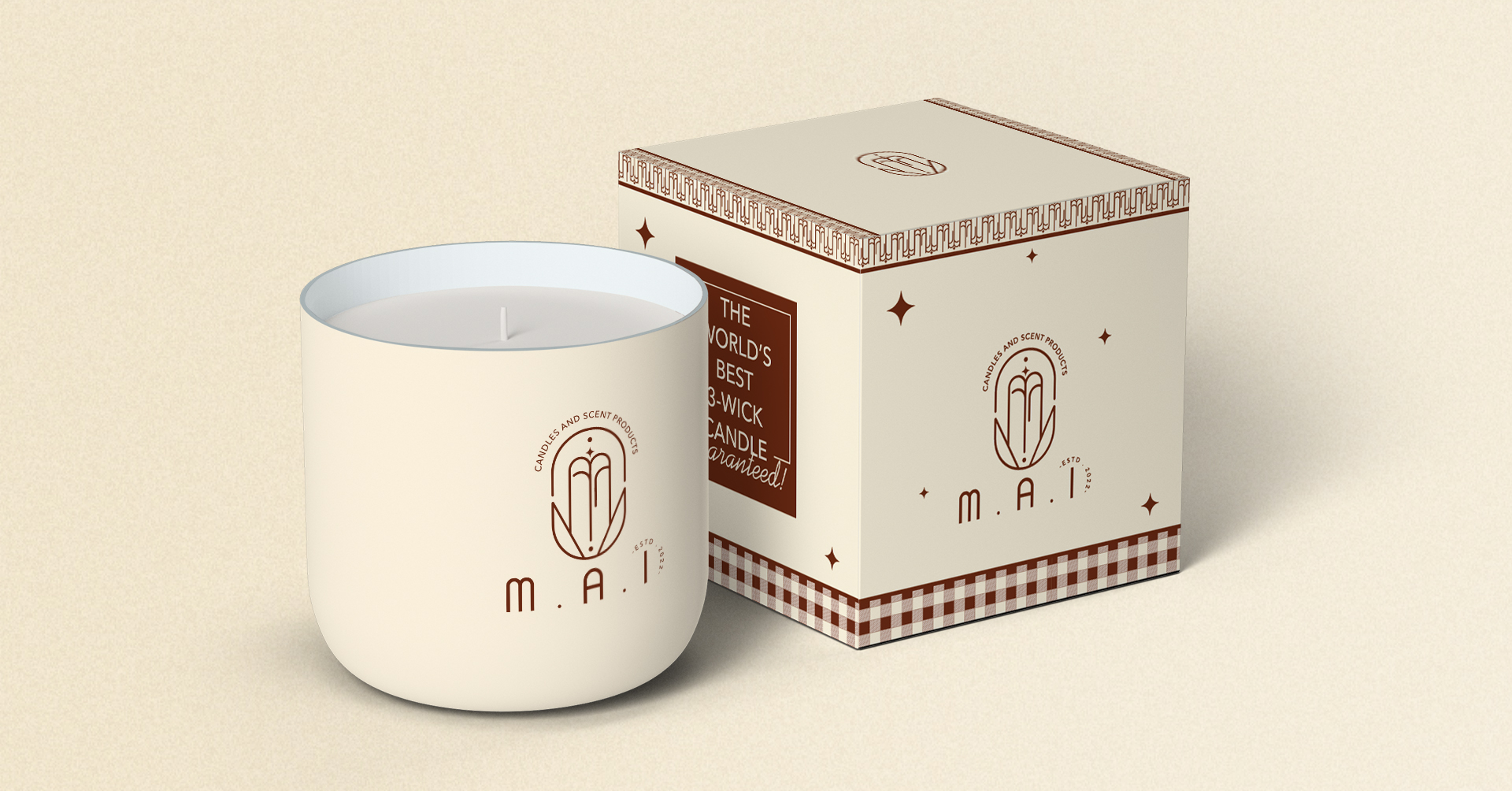
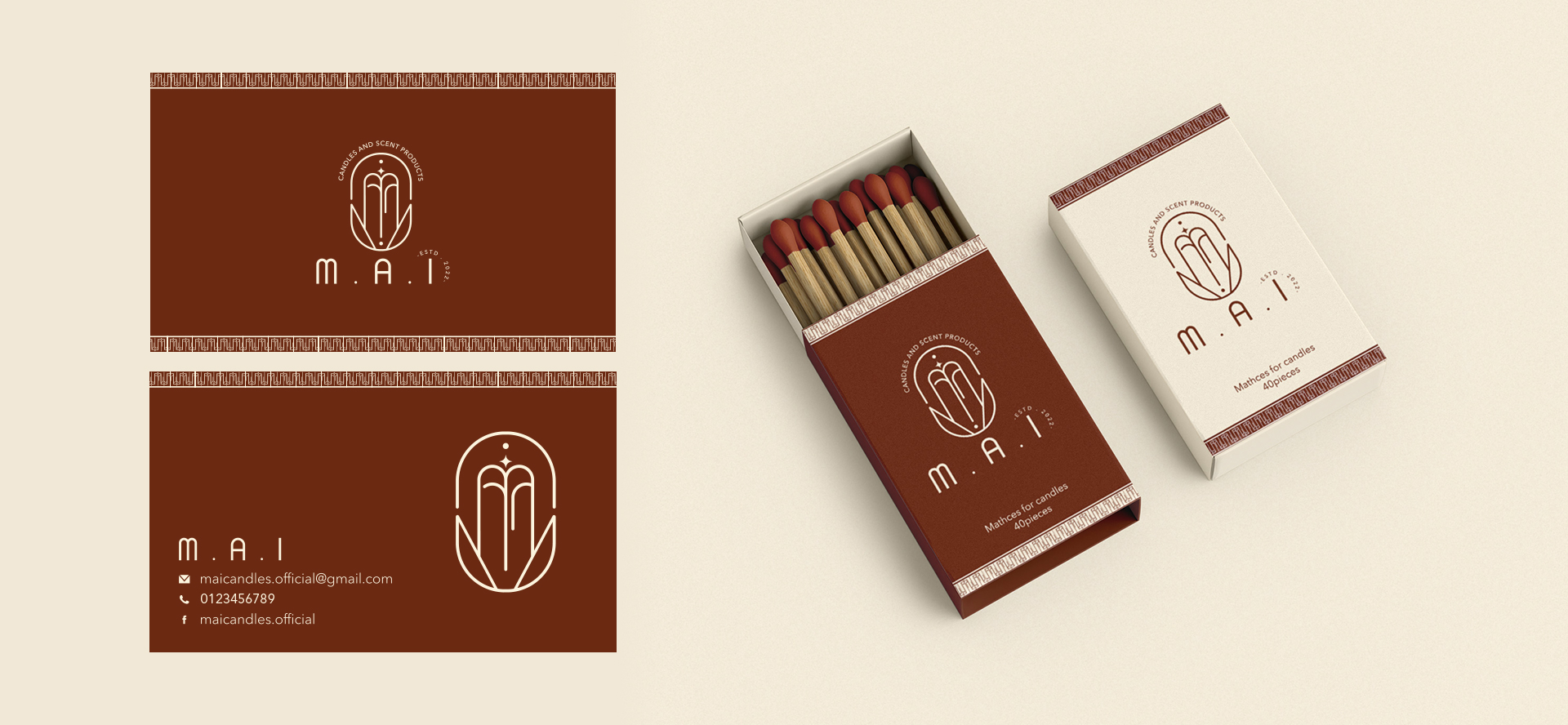
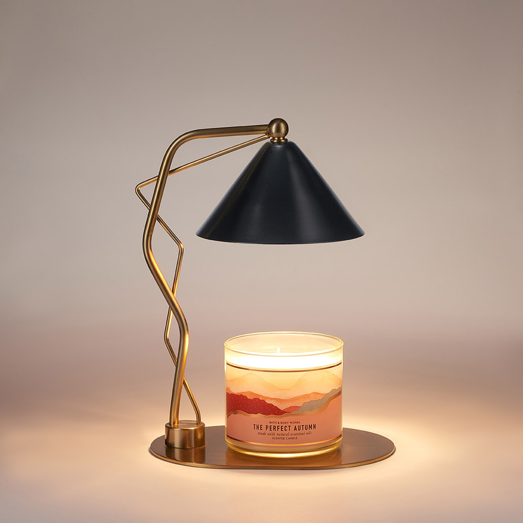
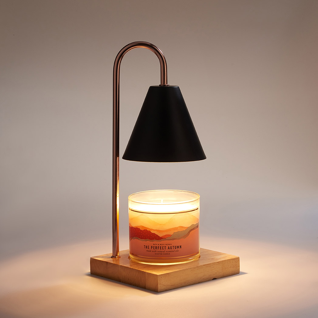
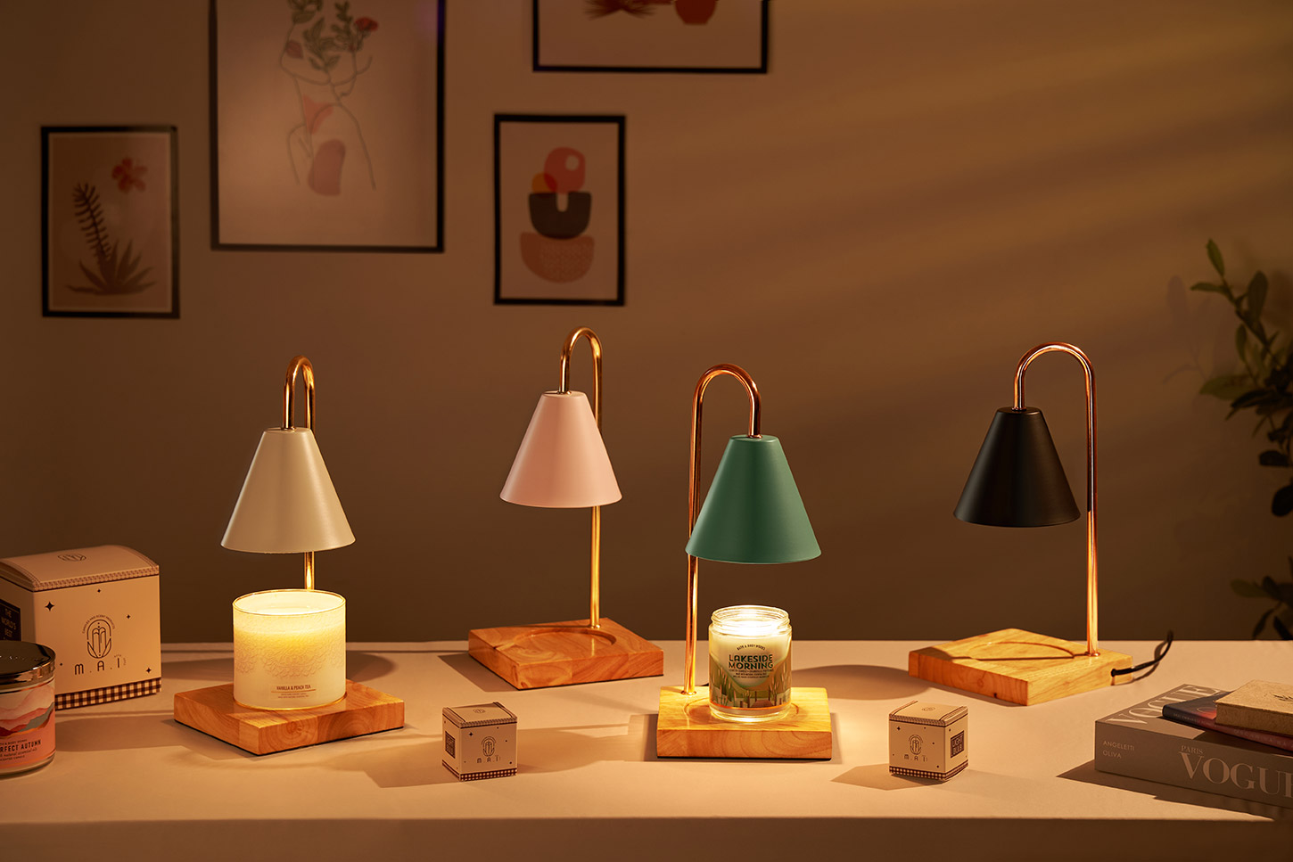
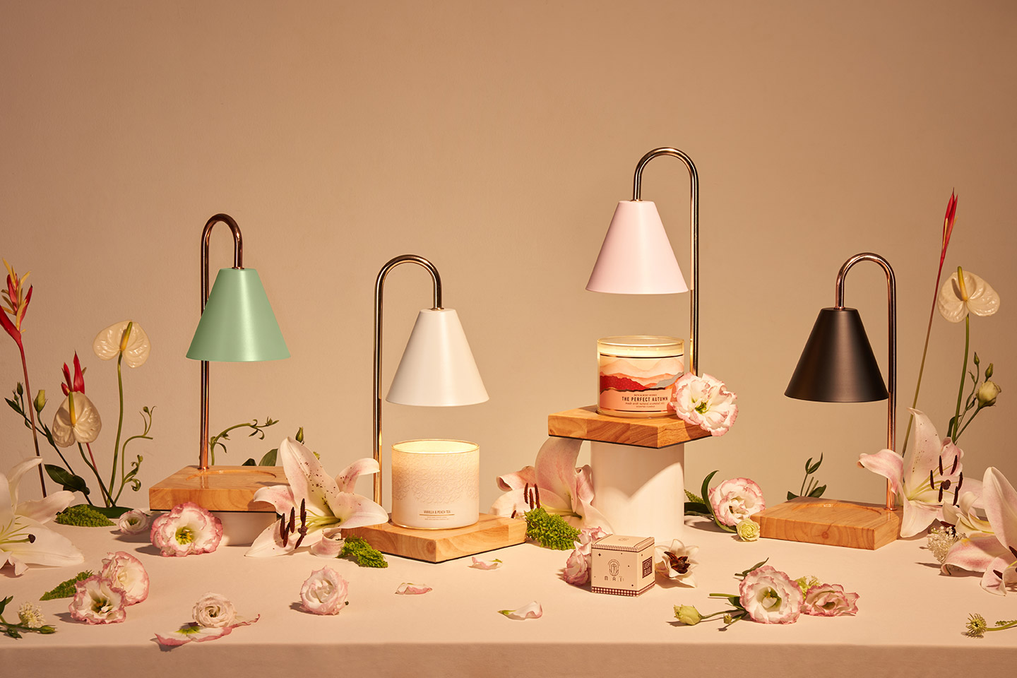
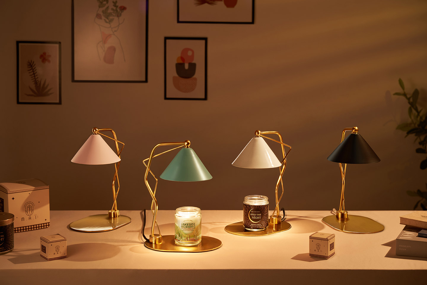
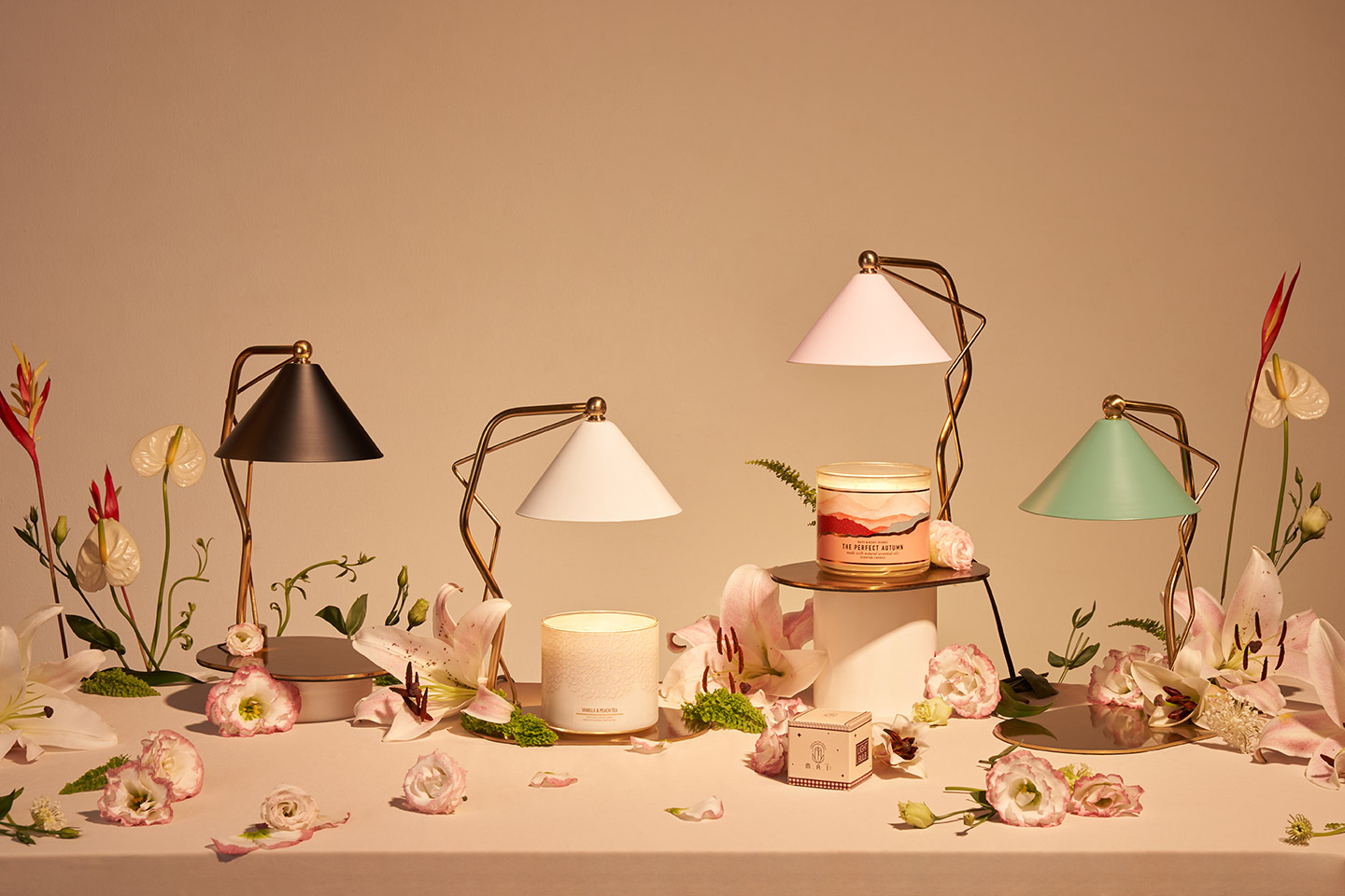
M.A.I is a distinguished brand that specializes in creating exquisite aromatherapy lamps and scented candles, designed to elevate your sensory experience.
The M.A.I logo is a striking blend of artistry and symbolism, incorporating the letters "M," "A," and "I" alongside an image that represents the warm glow and soothing heat radiating from a burning candle lamp. This thoughtful design not only exudes elegance and gentleness but also conveys a sense of luxury and sophistication.
Employing a sans-serif font with slender, uniform lines, the logo achieves a minimalist yet refined aesthetic. This simplicity allows it to stand out while resonating with a sense of calm and tranquility. Overall, the M.A.I logo encapsulates the essence of gentleness and beauty, reflecting the brand's commitment to creating products that enhance well-being and promote relaxation. Whether you are seeking to transform your space or indulge in a moment of self-care, M.A.I offers a perfect blend of style and serenity.
COLOURS
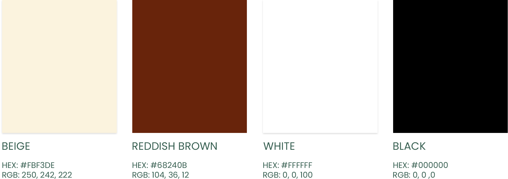
The color system plays a crucial role in brand identity. A well-coordinated combination of colors creates a lasting impression and distinctiveness in the eyes of customers.
The primary color chosen for M.A.I is a warm, luxurious reddish-brown, which aligns perfectly with the brand's premium positioning while maintaining a sense of approachability and warmth. Complementing this is a soft beige that evokes feelings of calmness and relaxation. Together, these colors reflect the brand’s commitment to sophistication and comfort, making it inviting for users.
TYPOGRAPHY
The primary typeface for the M.A.I brand is "Avenir Next W1G". The font is sans serif, simple and easy to use. Can be used in headlines and body text.
OVERVIEW
Lorem Ipsum is simply dummy text of the printing and typesetting industry. Lorem Ipsum has been the industry's standard dummy text ever since the 1500s, when an unknown printer took a galley of type and scrambled it to make a type specimen book. It has survived not only five centuries, but also the leap into electronic typesetting, remaining essentially unchanged. It was popularised in the 1960s with the release of Letraset sheets containing Lorem Ipsum passages, and more recently with desktop publishing software like Aldus PageMaker including versions of Lorem Ipsum.
A B C D E F G H I J K L M N O P Q R S T U W X Y Z
LETTERS
AaBbCc
NUMBERS
1234567890
!@#$%^&*()
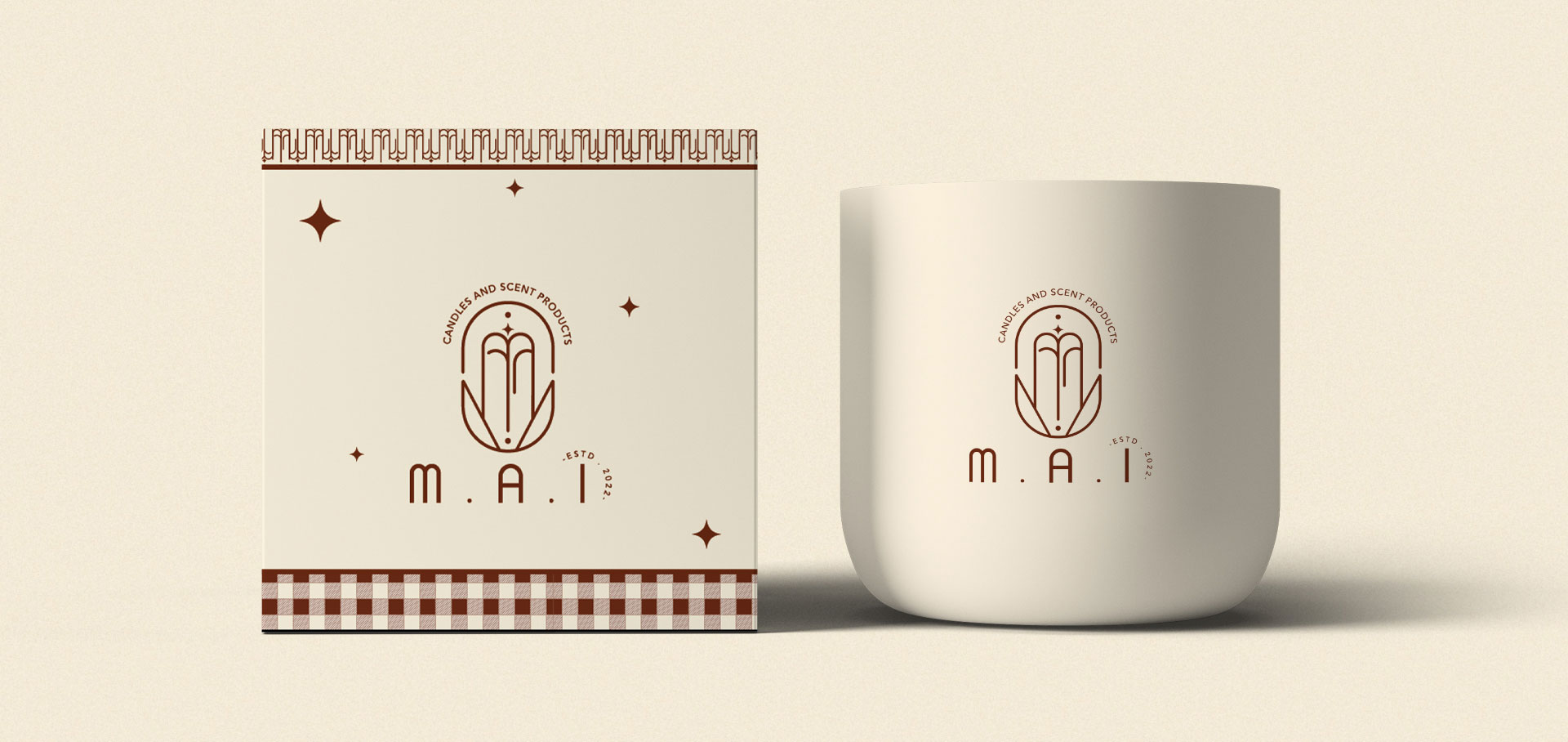
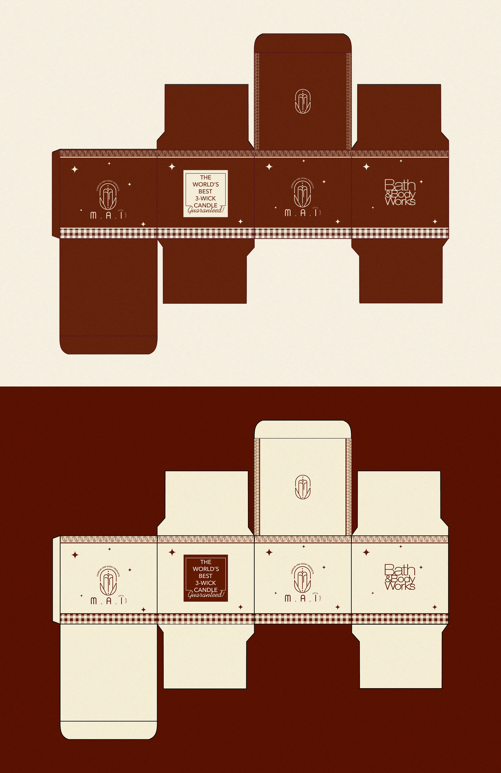
PACKAGING
IMAGECY
PHOTOGRAPHY
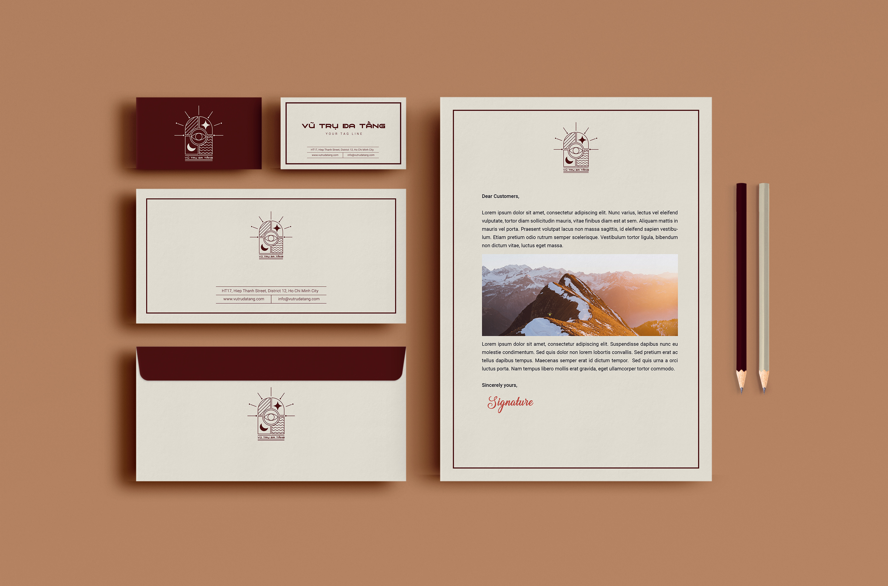
VŨ TRỤ ĐA TẦNG
Branding | 2022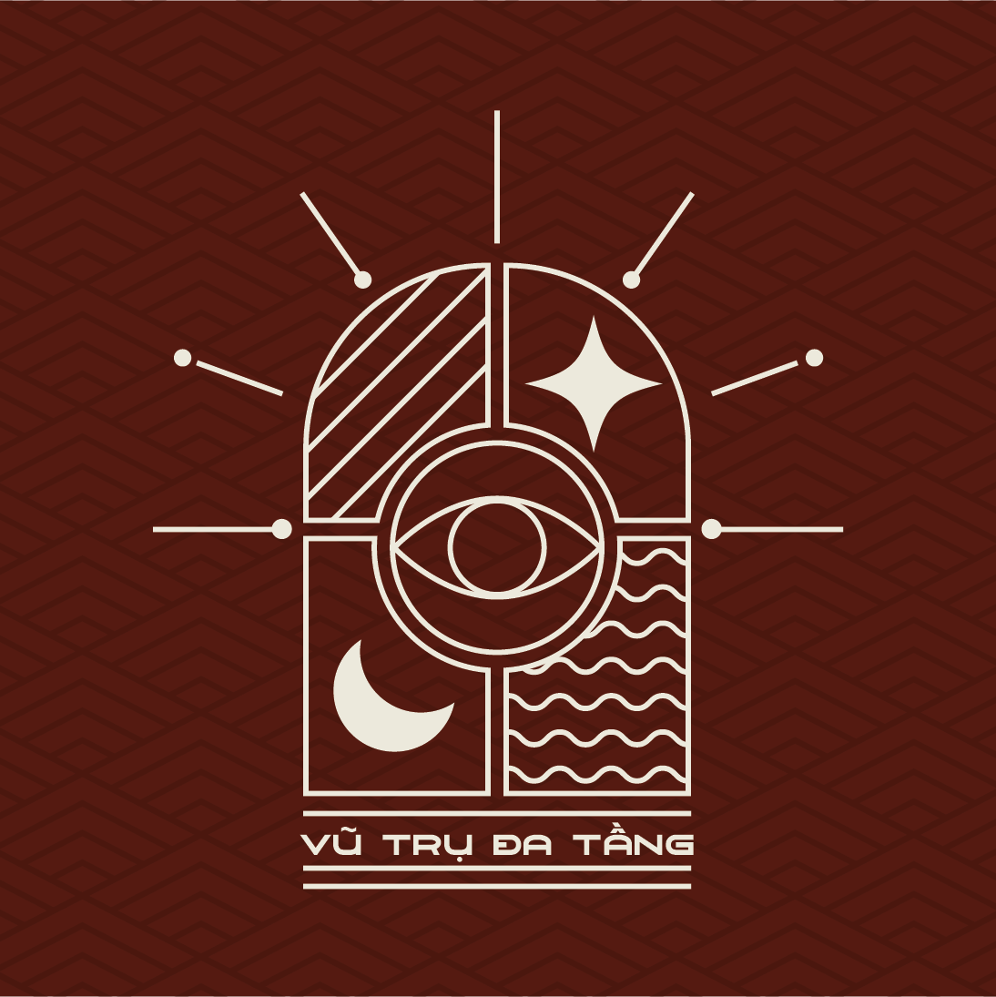
About The Logo
VŨ TRỤ ĐA TẦNG
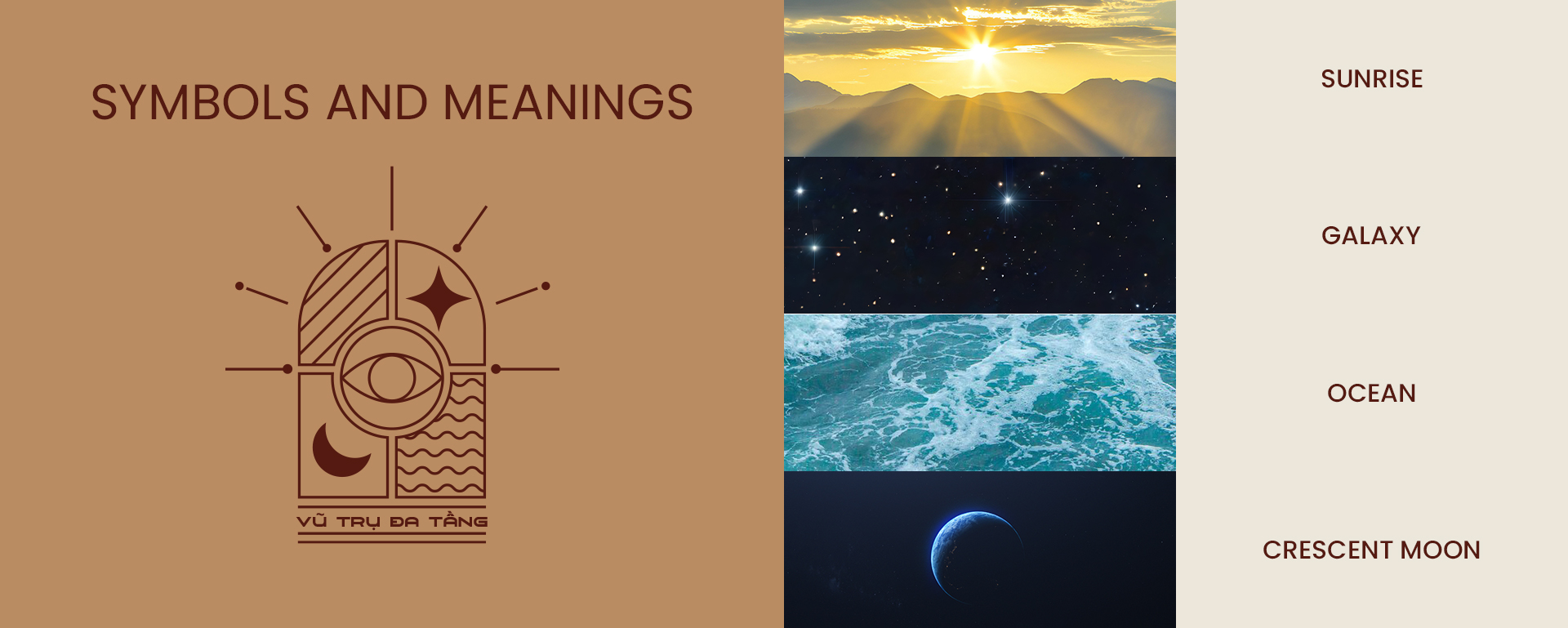
The concept of a multi-layered universe developed by a Gen Z creator is truly unique and fascinating. This universe encompasses various product categories, such as fragrance (the layer of scent), silk (the layer of clothing), and skincare (the layer of beauty), among others. The logo should reflect the diversity of these products, drawing inspiration from universal elements like light, water, the moon, and stars.
Additionally, the eyes in the design symbolize the brand's deep understanding of its customers while embodying the strong, bold personality characteristic of Gen Z.
This combination of elements not only highlights the variety of offerings but also resonates with the essence of modern youth culture, making it relatable and appealing.
COLOURS

LOGO FONT

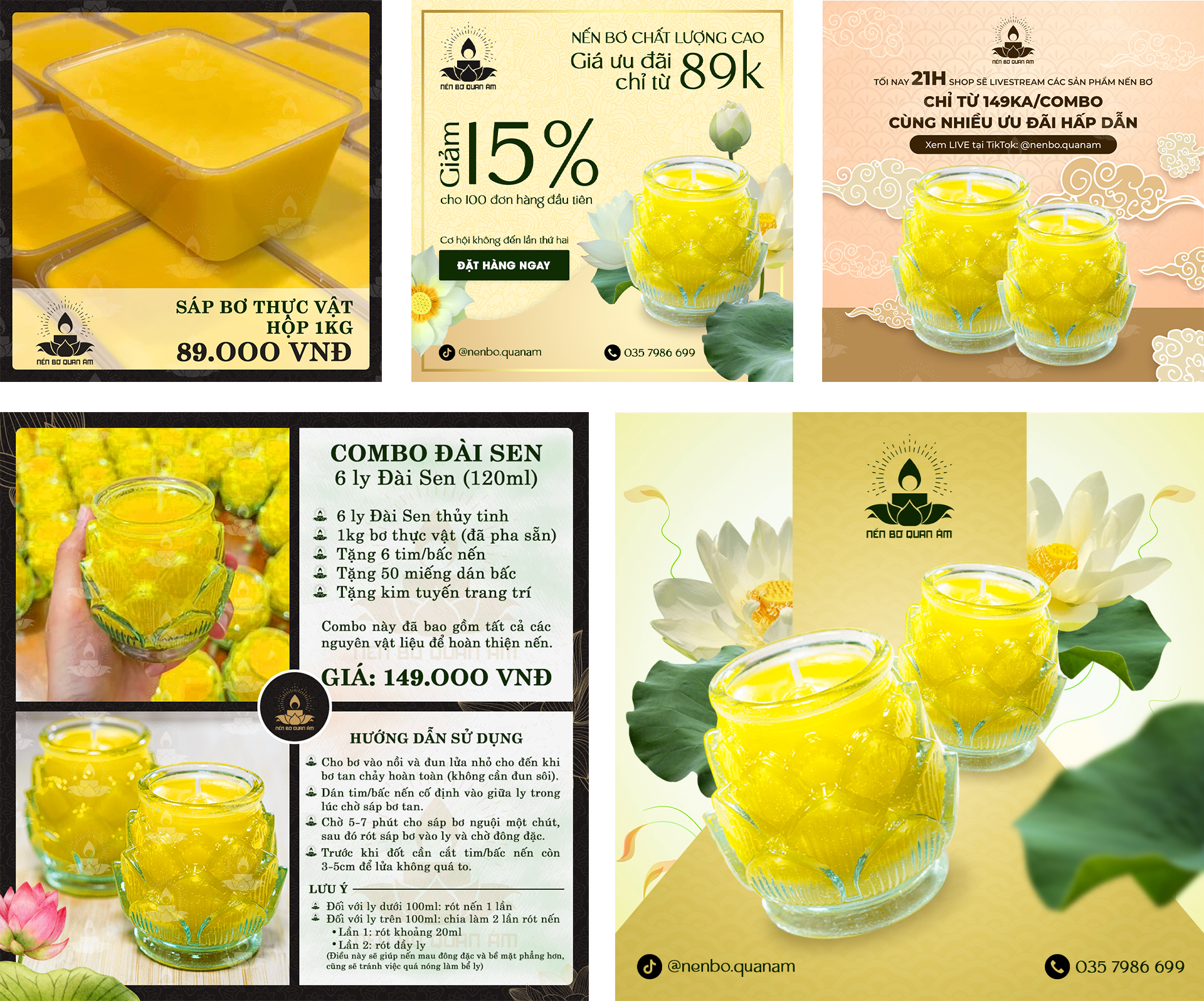
NẾN BƠ QUAN ÂM
Branding | 2023 | Fanpage
ABOUT THE LOGO

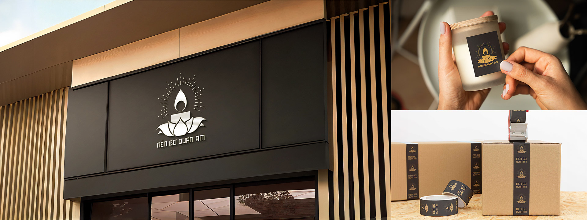
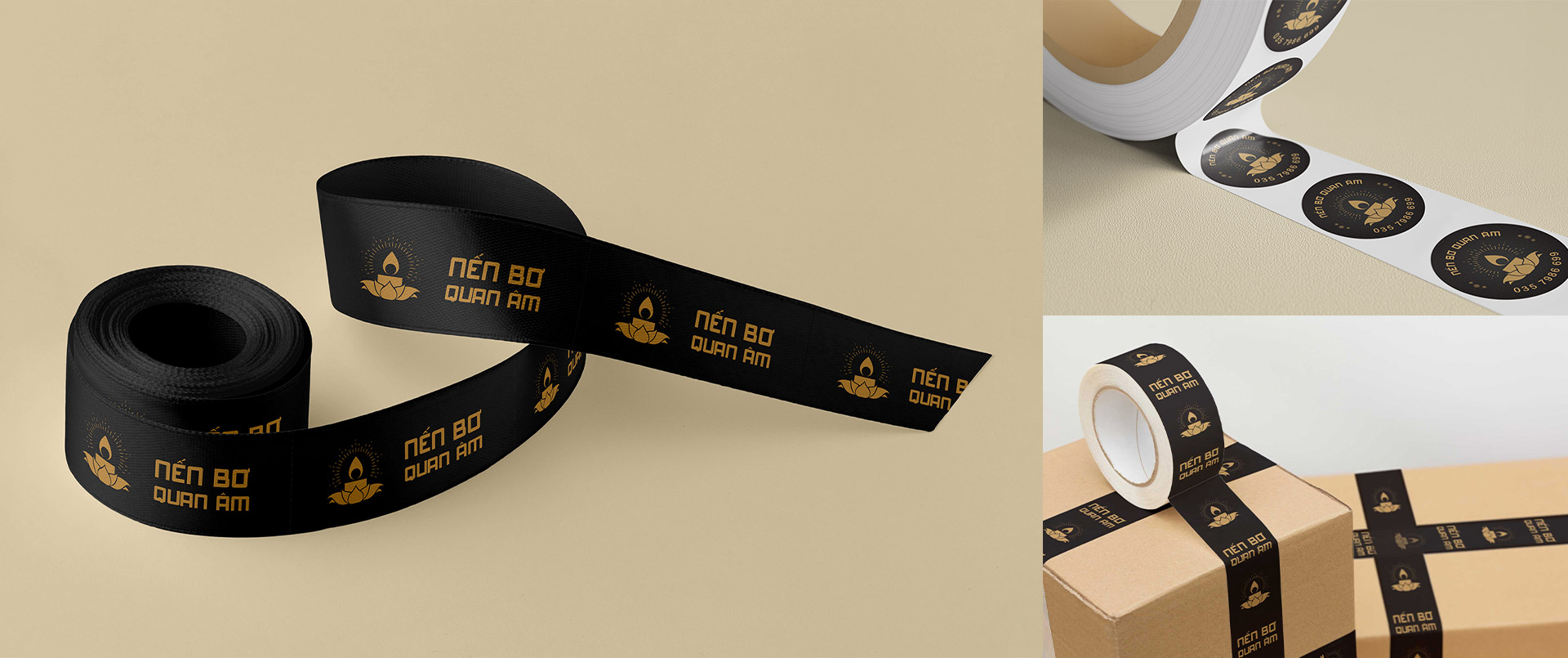
The "Quan Am Butter Candle" design is inspired by the halo of the Buddha, the lotus flower, and the soft glow of candles. The logo conveys a clear and immediate message from the first glance, making it approachable for the target customer segment. To enhance this accessibility, the brand chose a golden hue set against a dark background, symbolizing the candlelight and leaving a lasting impression on customers. This thoughtful combination of elements not only highlights the spiritual essence of the product but also reinforces its distinct identity in the market.
BRADING
IMAGECY


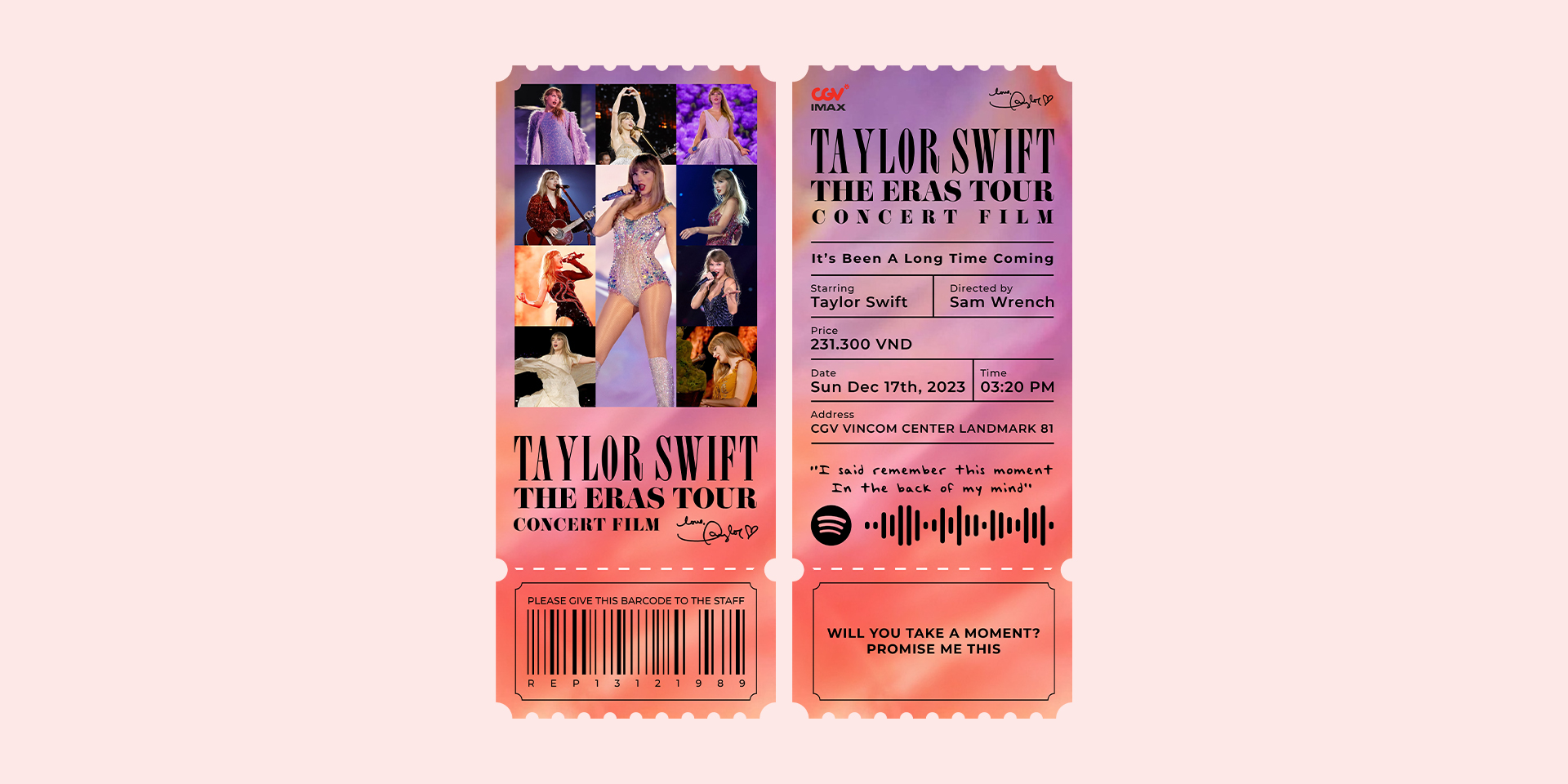
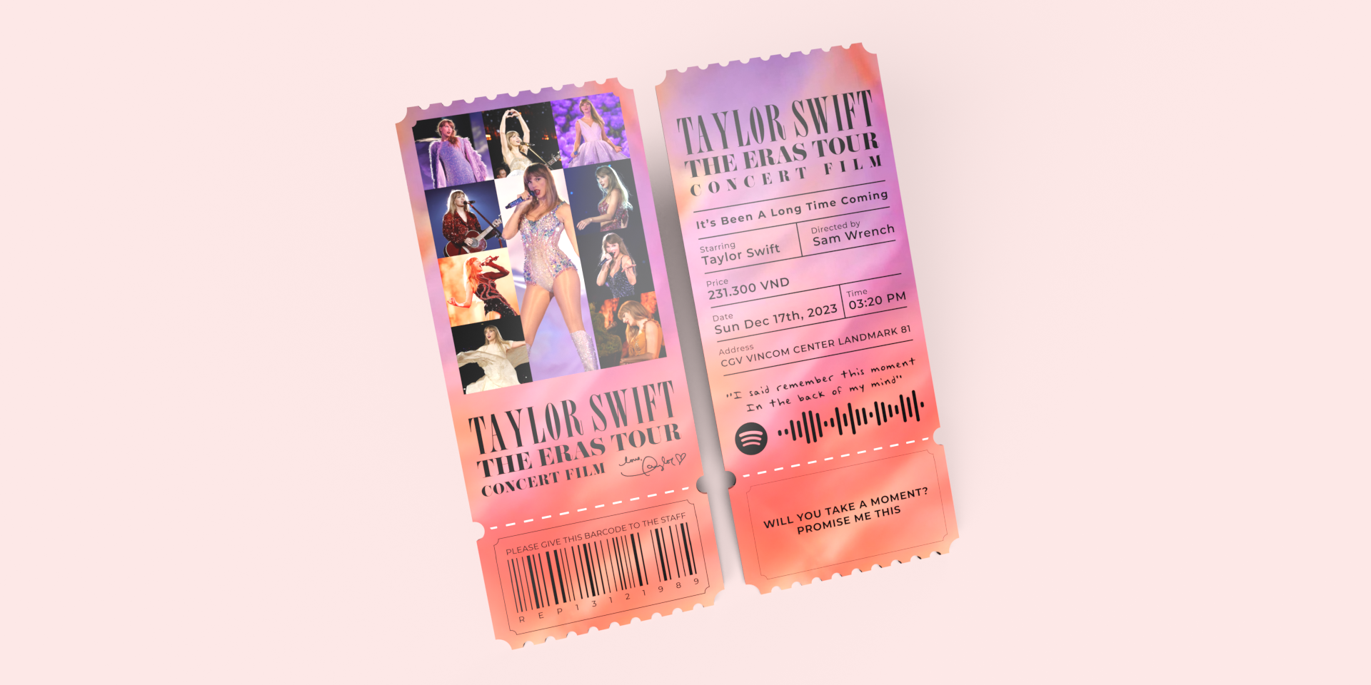
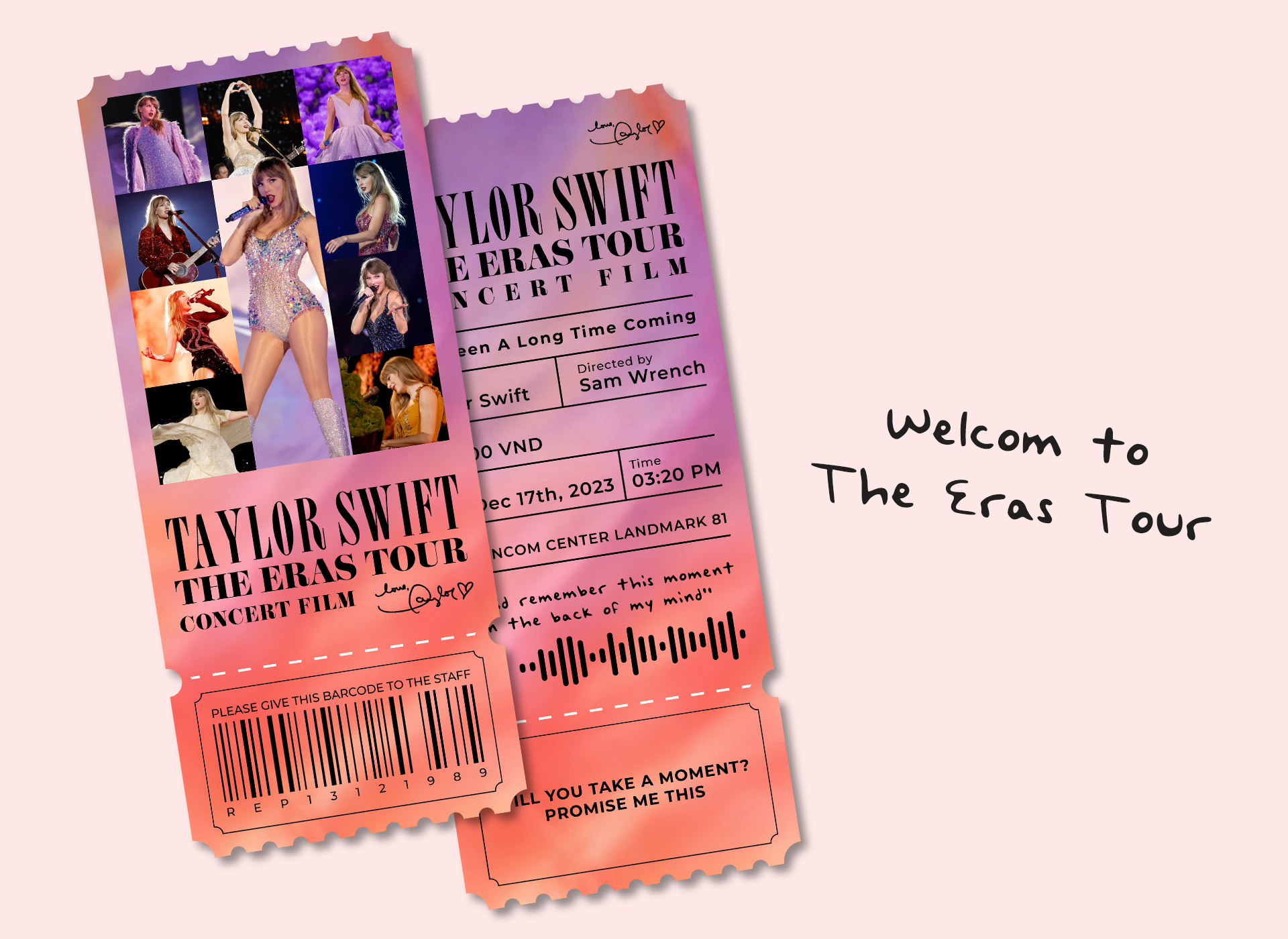
The Eras Tour Concert Film
Ticket | 2023 | Behance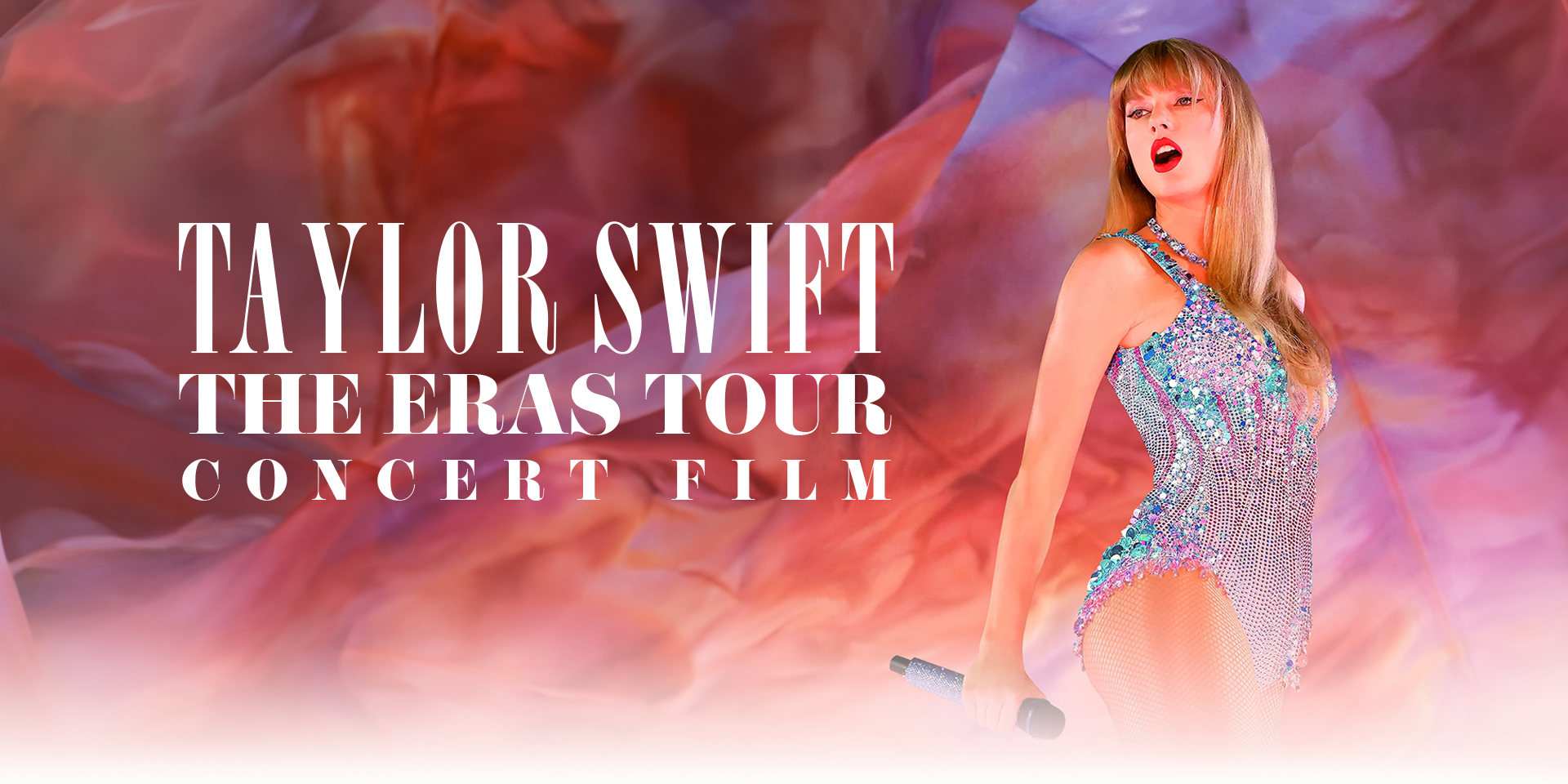


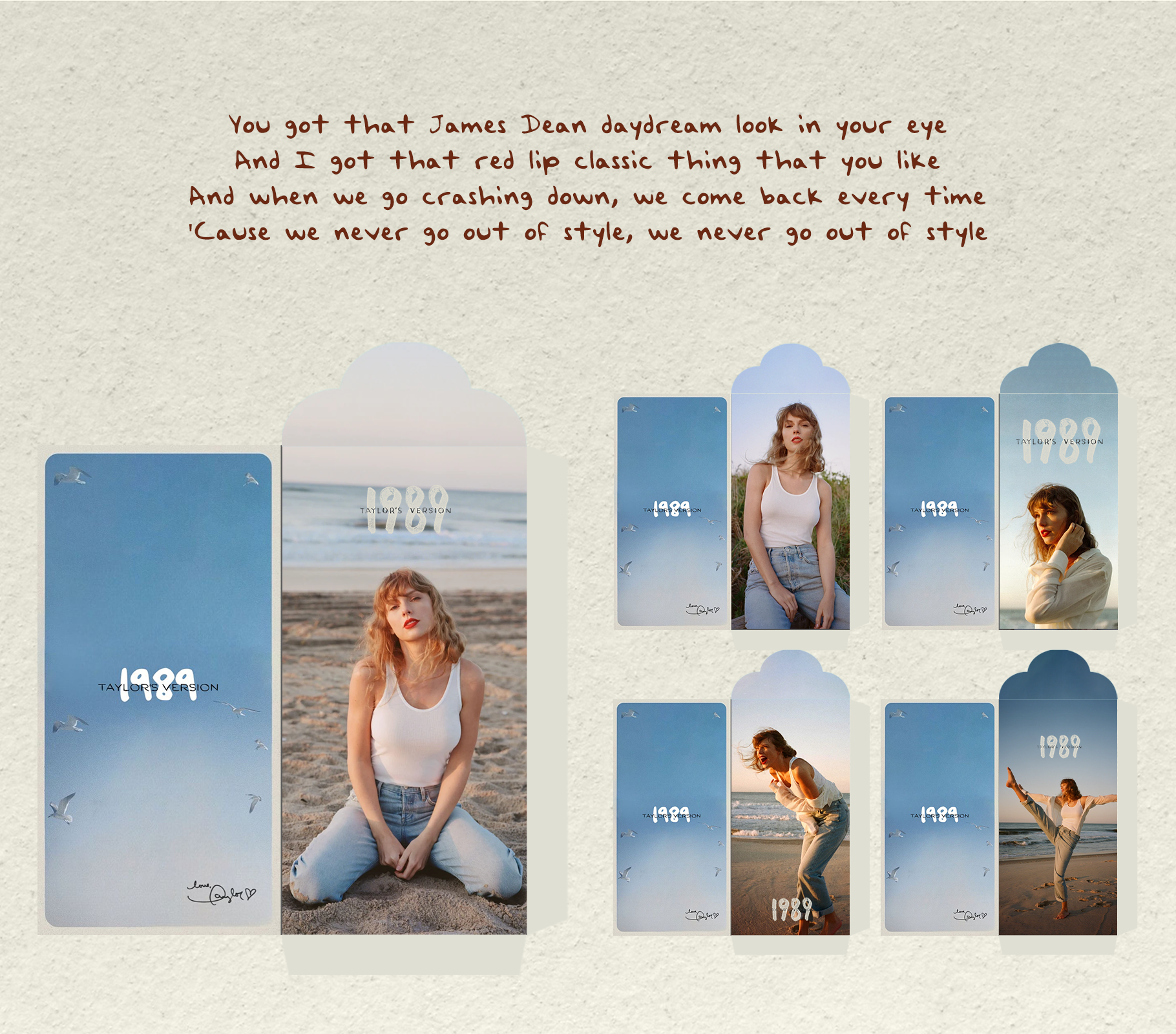
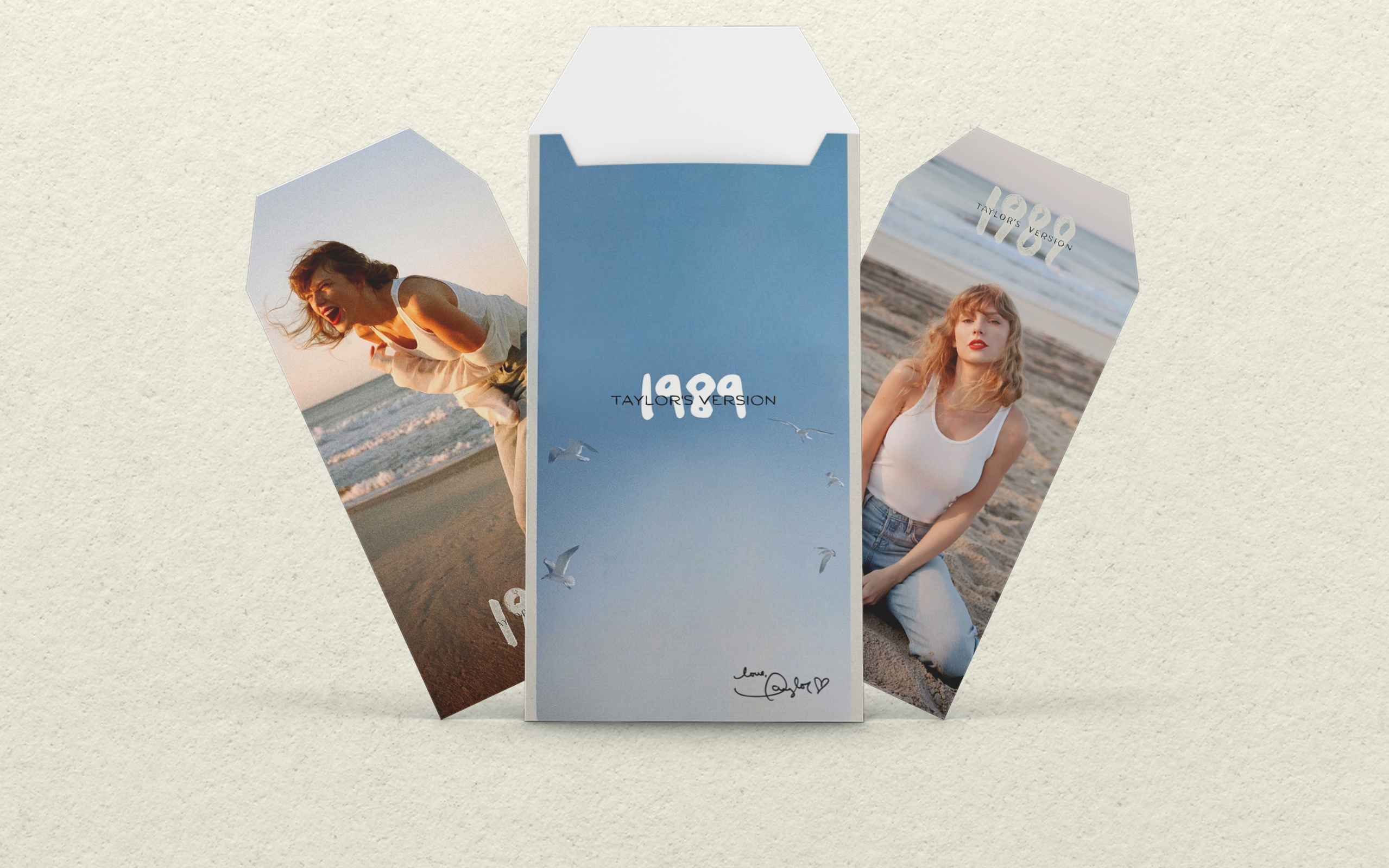
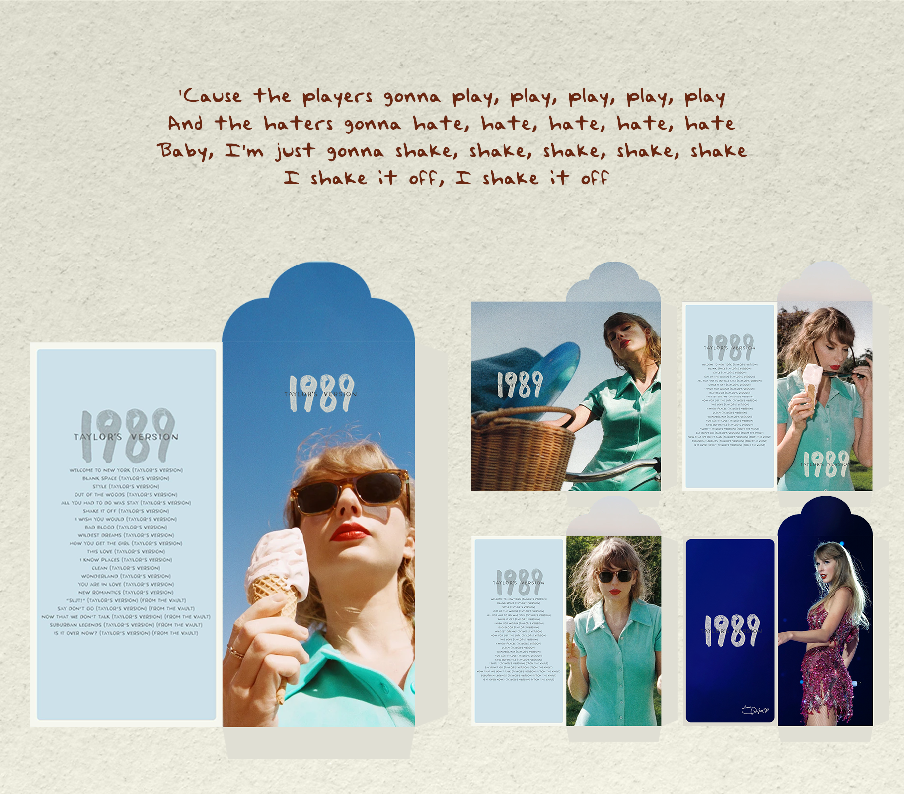
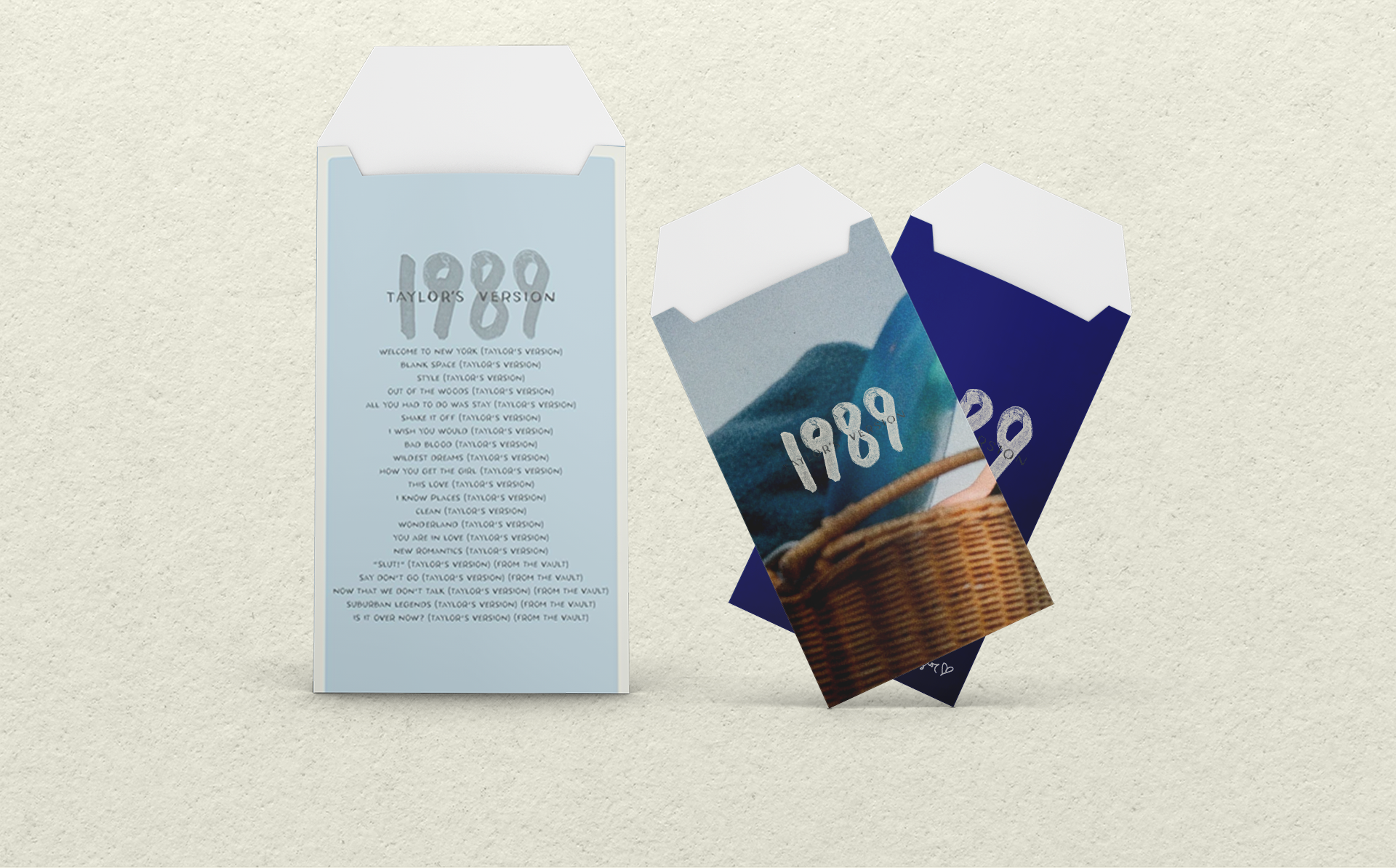
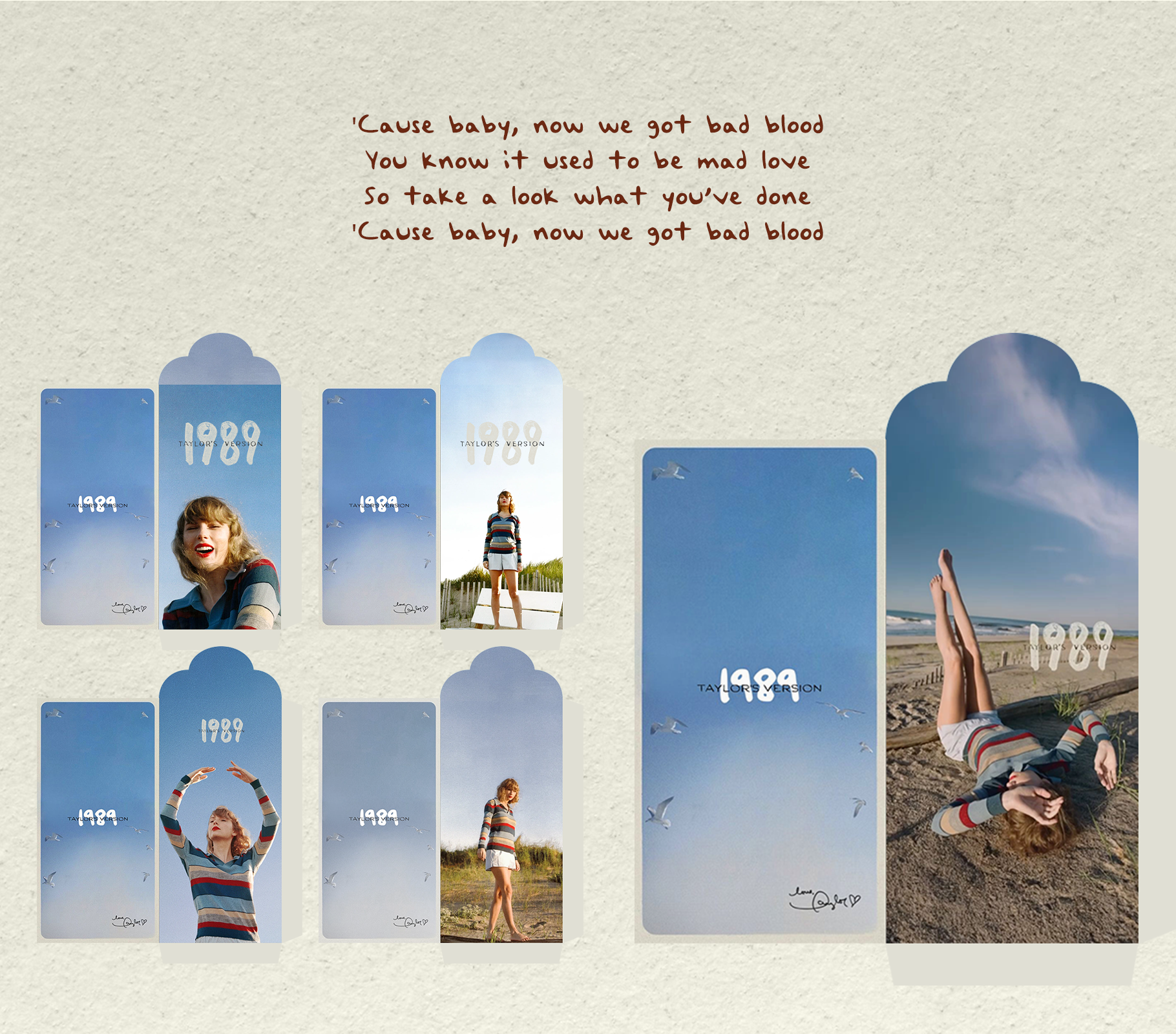
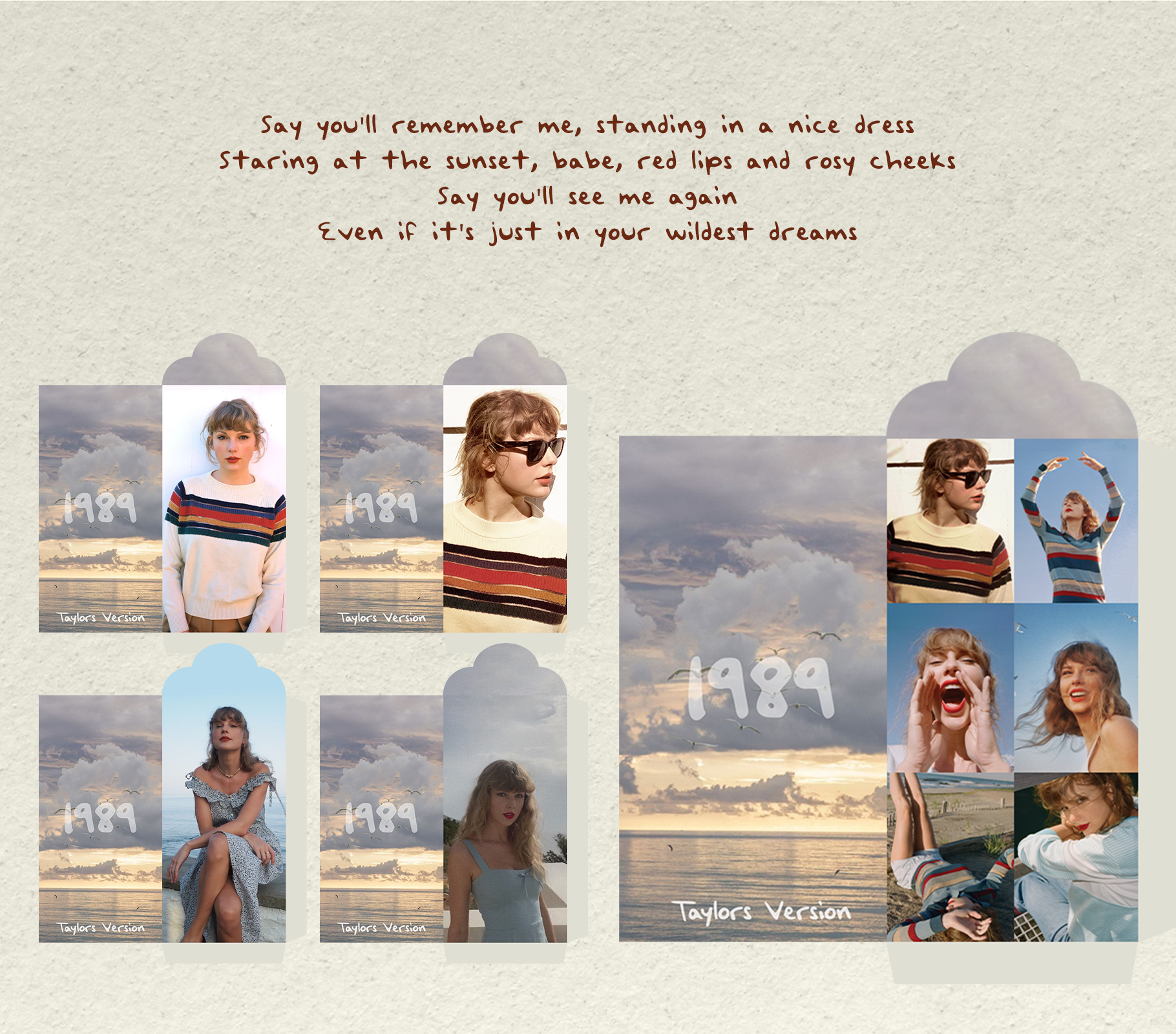
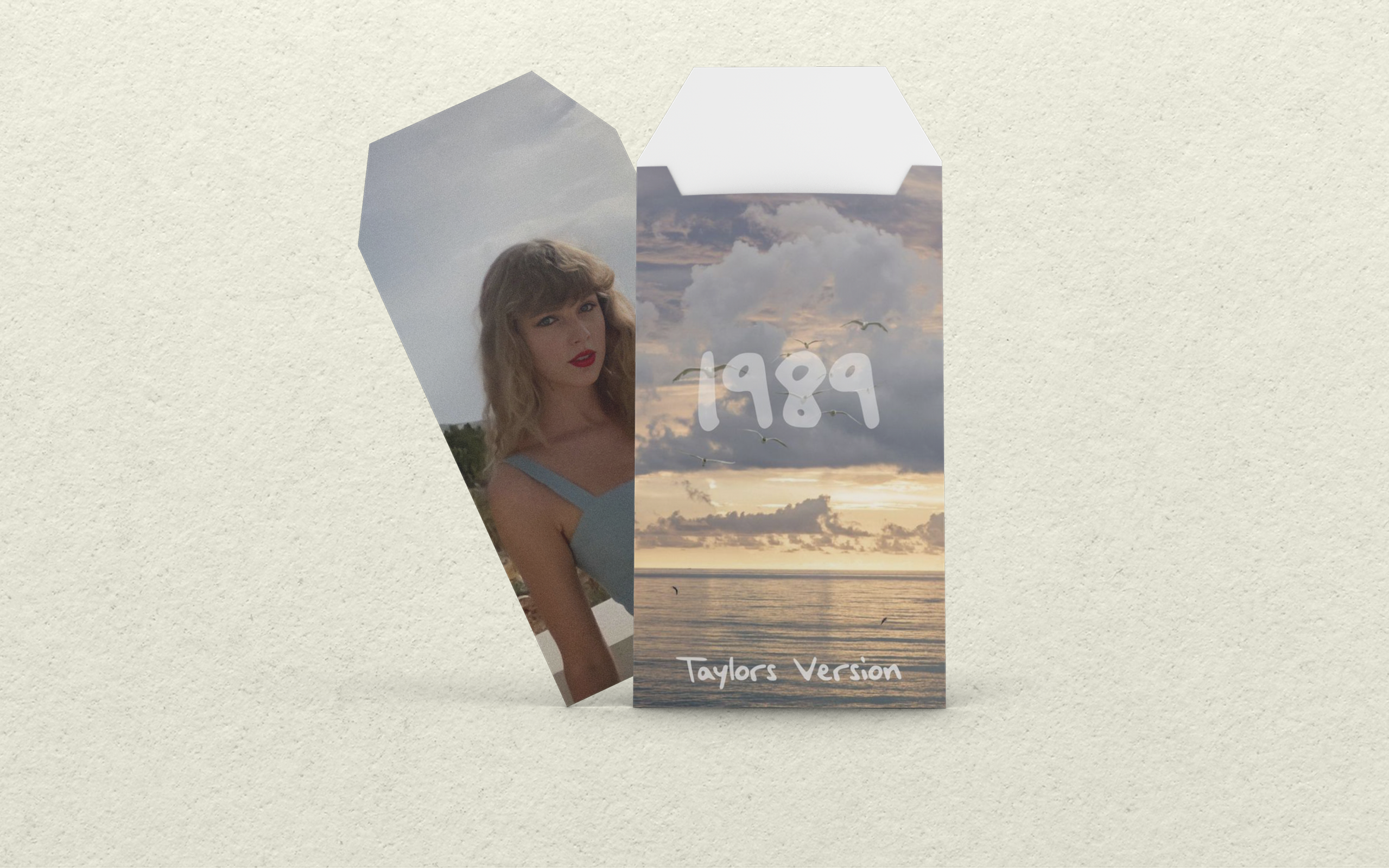
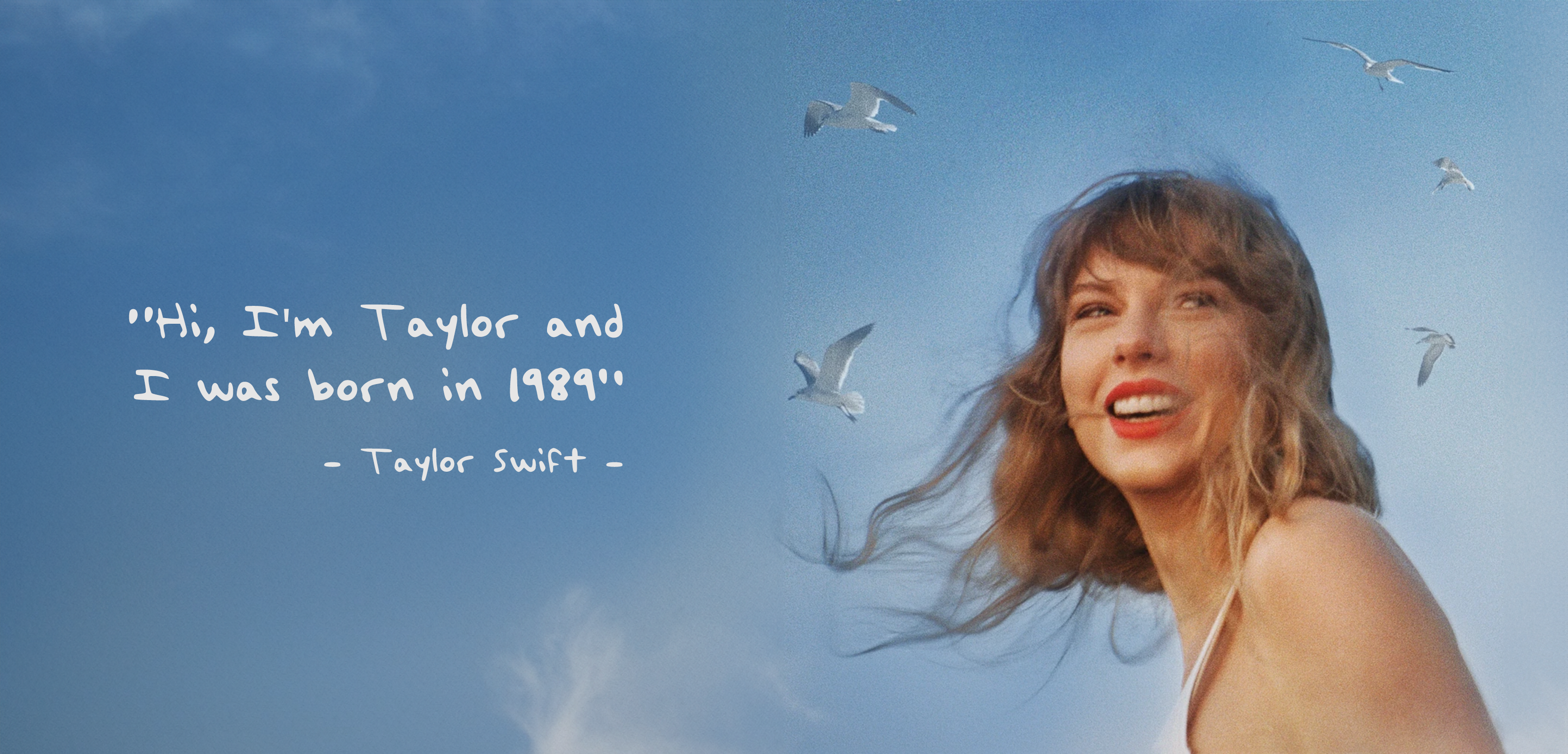
1989 Album (TV)
Lucky Money Envelope | 2024 | Behance




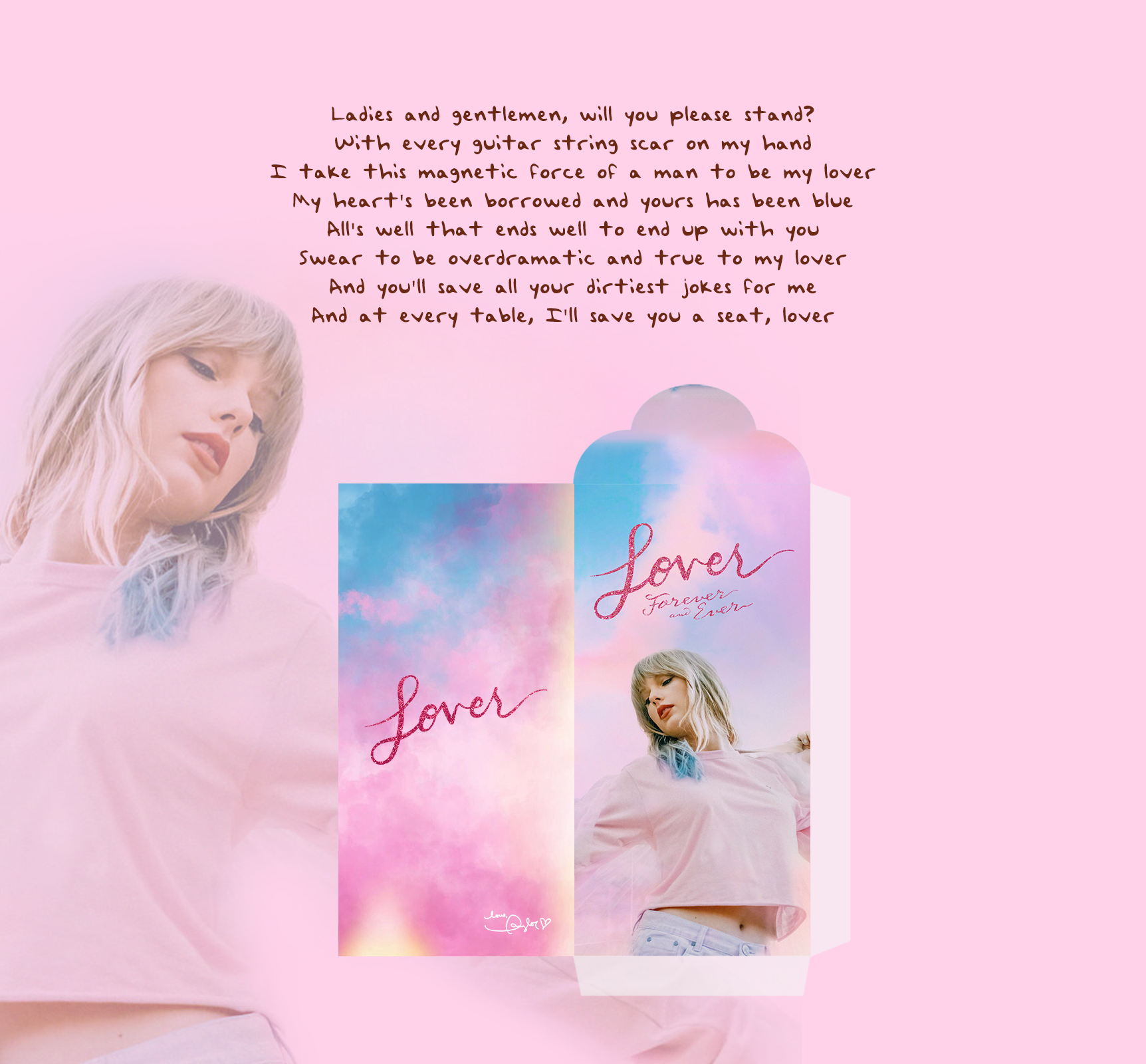
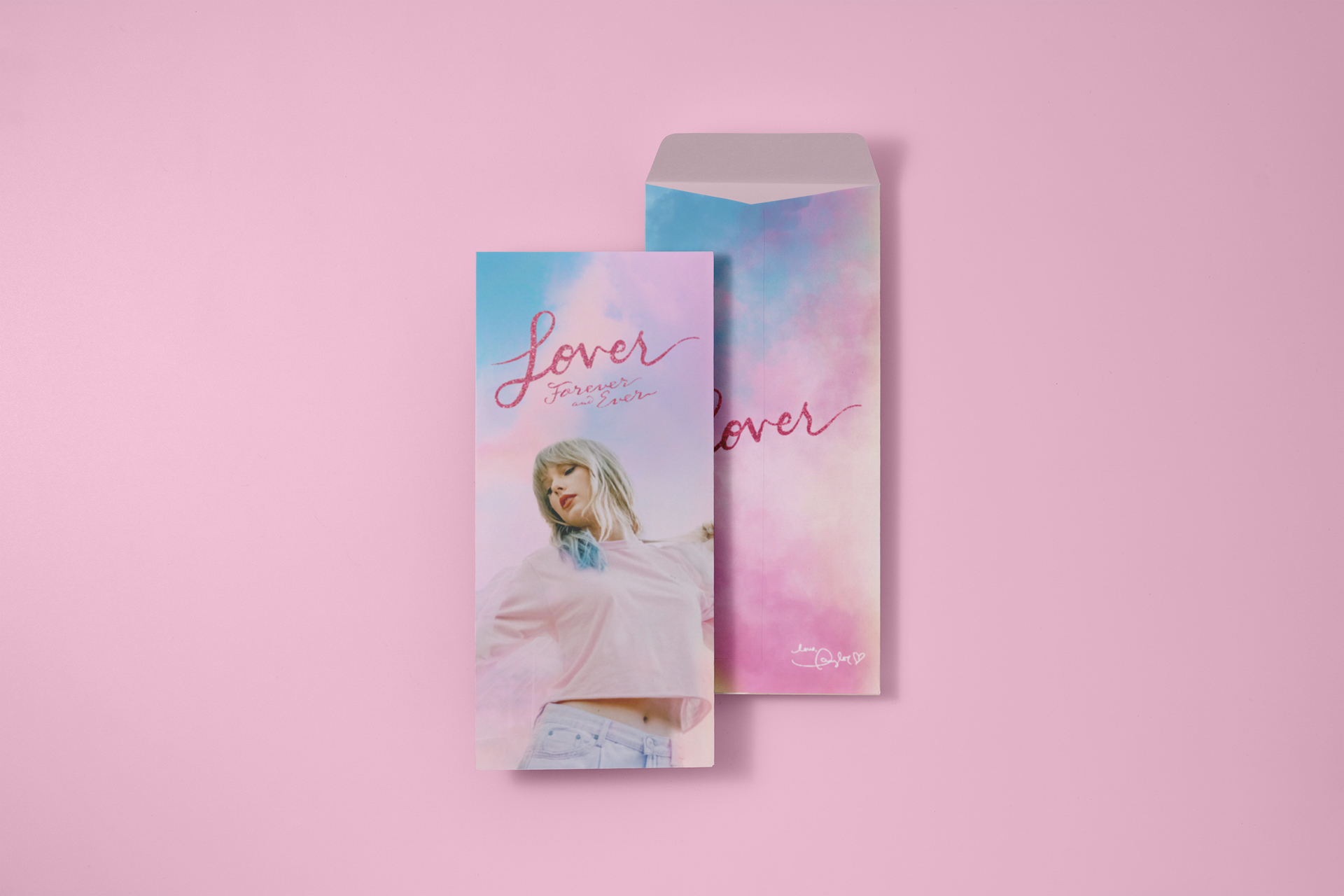
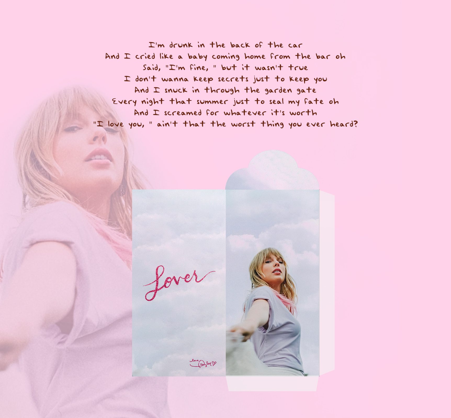
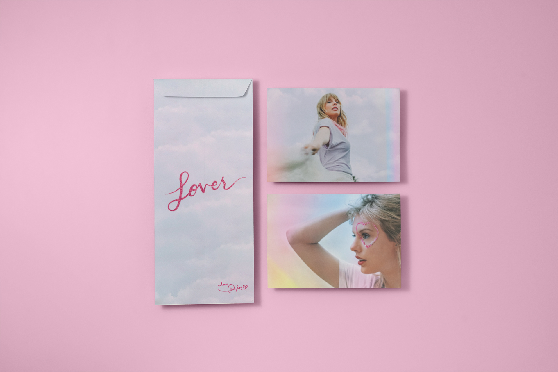
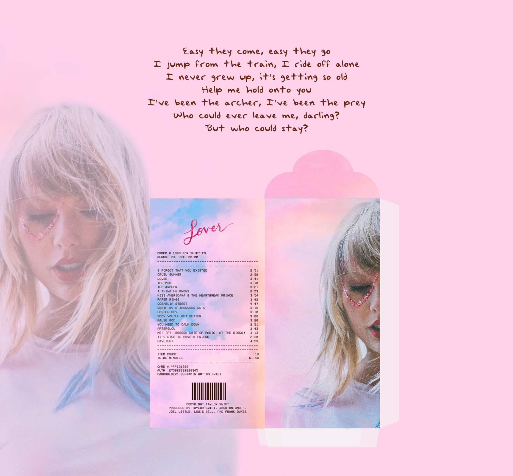
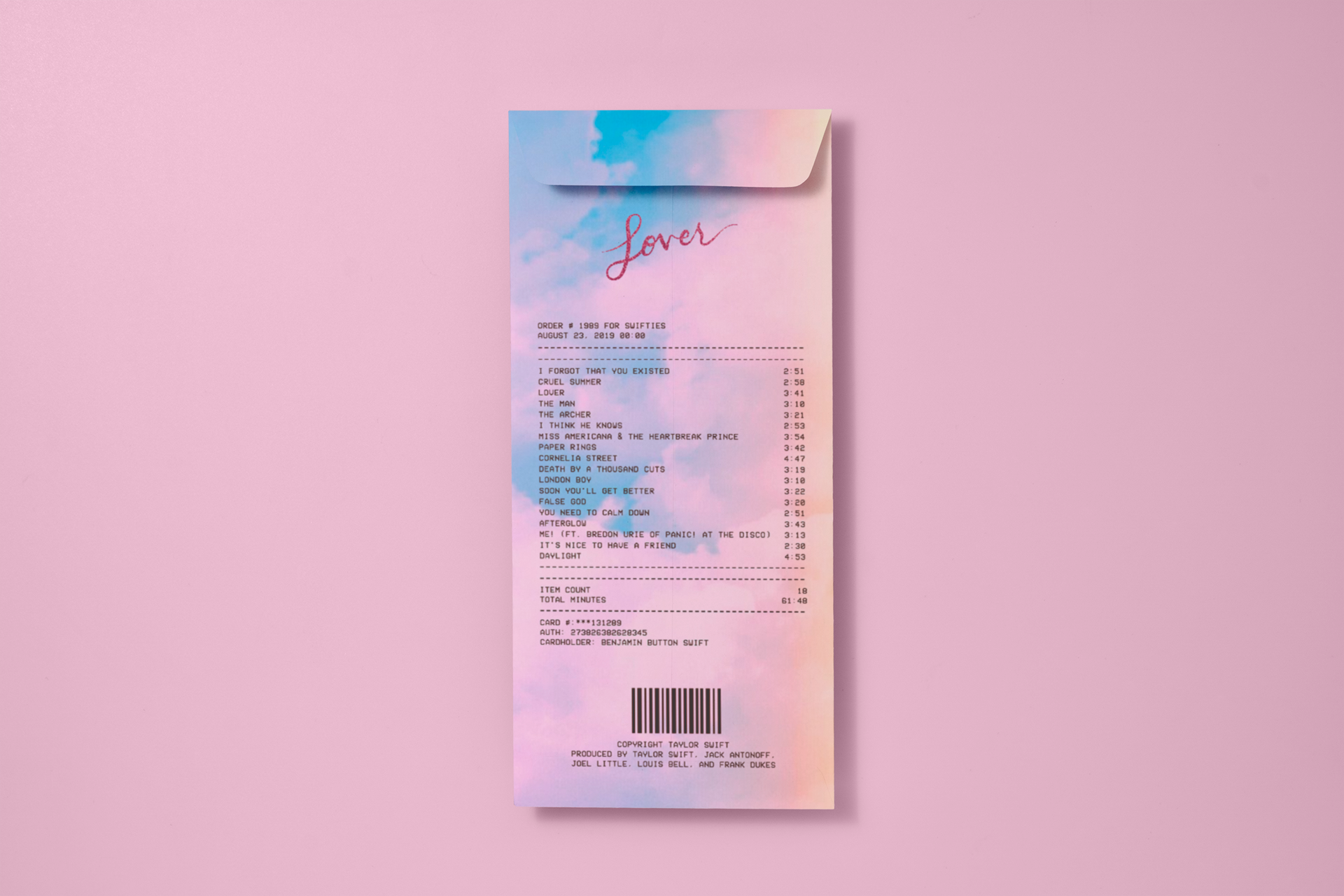
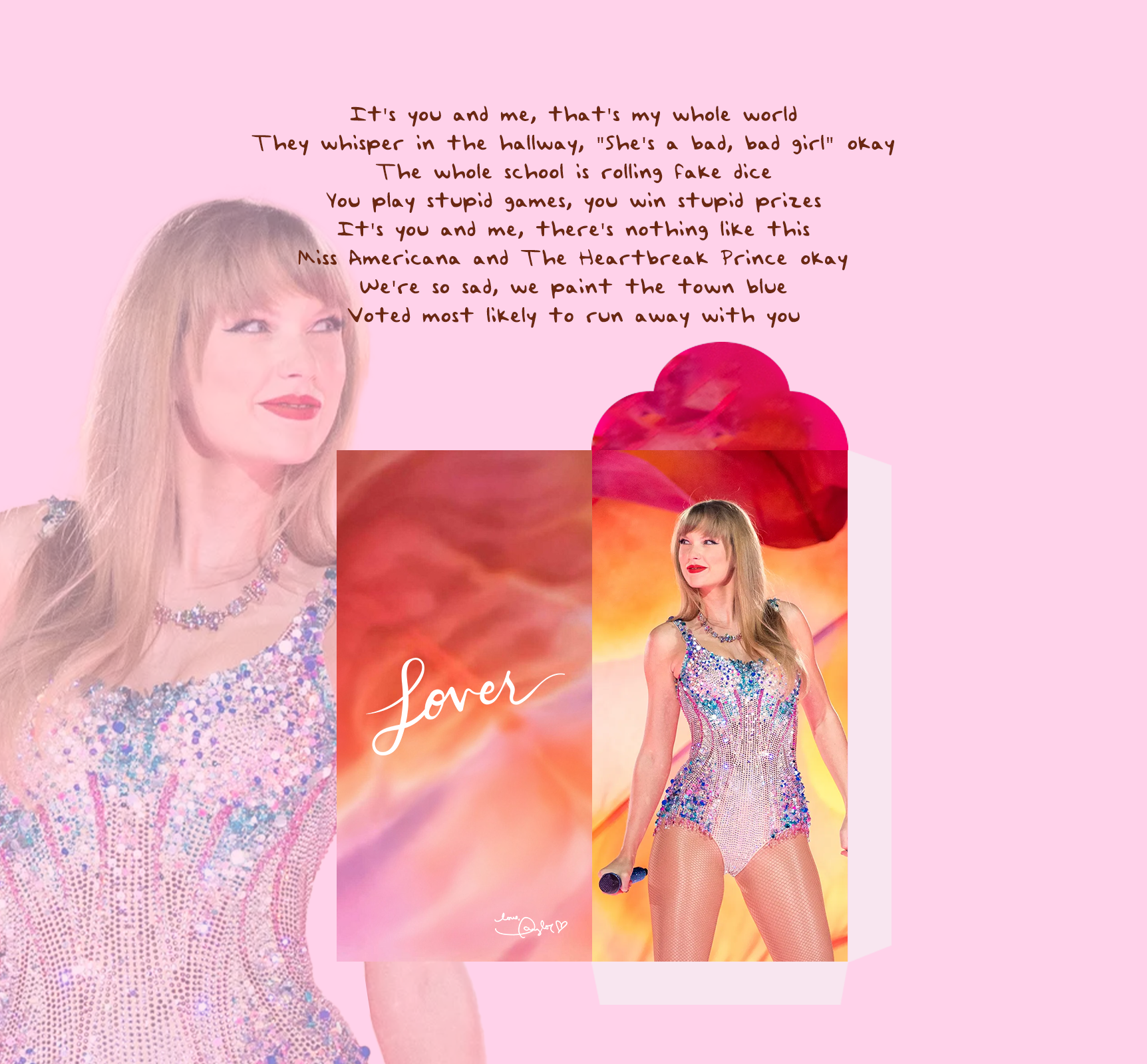
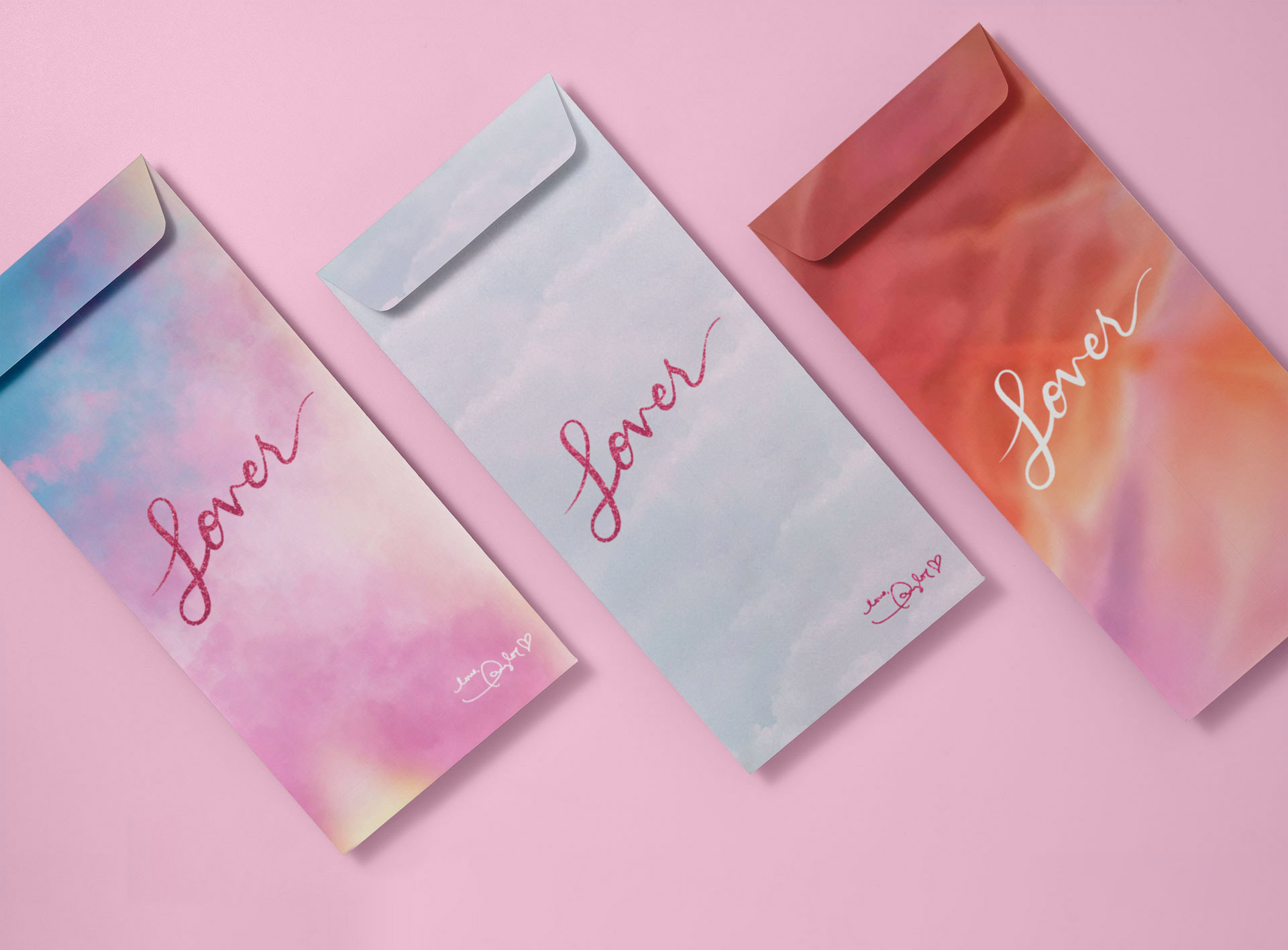
Lover (Album)
Lucky Money Envelope | 2024 | Behance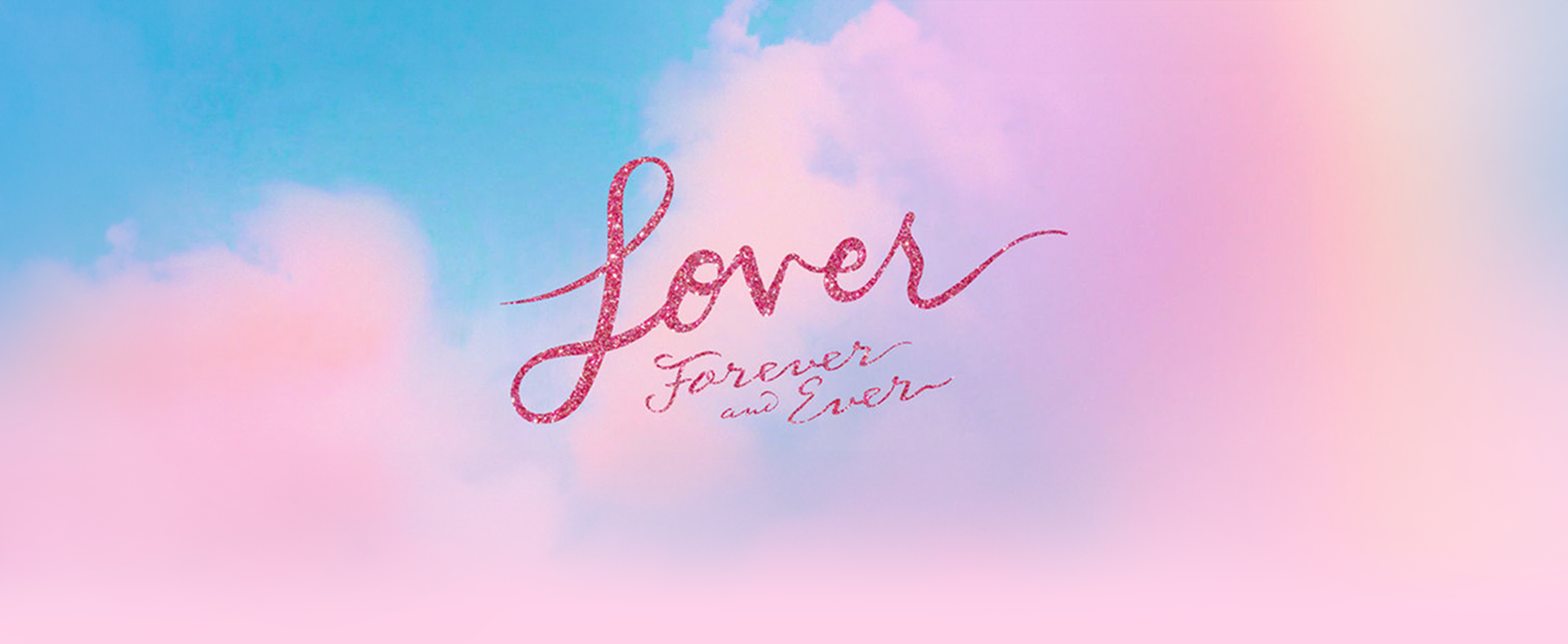

-
Phone Number
-
Emaildamduong9951@gmail.com
-
Telegram@arieus23
made with ♥ by me

